
Client
Kan
Industry
communication | Media
Skills
website_design | ux_design | ui_design | product_strategy
Starting Point
We first met KAN nine years ago. They weren’t called KAN yet, and there were barely six people there, looking for a good answer to the question: what justifies the existence of public broadcasting in Israel? The answer we shaped together was a simple yet ambitious vision: to raise the bar. To establish a broadcasting entity where the content is more important than the platform through which it’s consumed - one that manages to combine depth and intellectual challenge with a tone that’s energetic, accessible, and down to earth. Over the years, that vision came to life in thousands of different pieces of content: from podcasts that explain economics in human-friendly words, through original series that are both the height of art and the height of fun, to short digital videos that make the world easy - and enjoyable - to understand.
The Challenge
Our deep research uncovered that Kan’s audience behaves in distinct clusters. Each content category attracts a different demographic with unique daily rhythms and consumption habits. At the same time, analytics showed that users barely scroll beyond the first fold, turning the homepage - unintentionally, into the main source of news consumption. This raised a fundamental question: does the platform need both a homepage and a News tab? Should the News tab become the primary entry point? Combined with system limitations, operational constraints, and the outdated structure of the previous site, it was clear the experience required a complete rethink.
The Solution
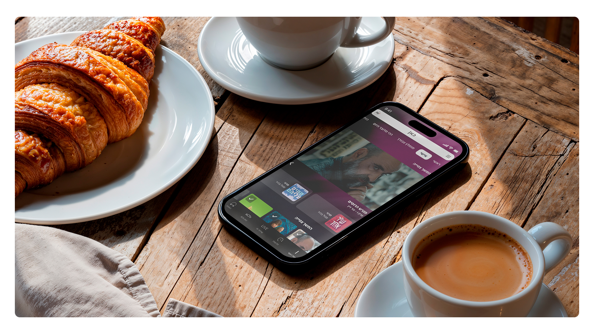
We redesigned the homepage to become a smart, modular content hub that surfaces rich, varied content - without relying on user scrolling. The new structure expands the value beyond news, encourages sign-ups, and opens the door to robust personalization. The registration flow enables proactive content recommendations based on an algorithm that learns the user’s preferences and even saves progress in series they’ve started. The “What’s Happening Here” component reinforces Kan’s innovative, dynamic brand with a scrolling element that follows the user and organizes all content worlds into easily accessible tabs.
The Shift
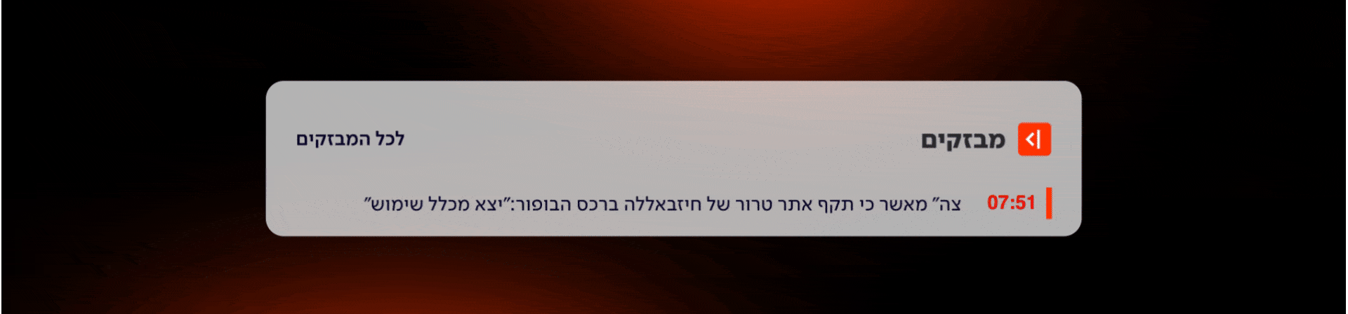
The redesigned homepage and news page form a modern, fast, and engaging platform where each content category is presented in a compelling, action-driven way. We extended the Kan News visual language to support high-impact moments with dedicated layouts—such as wide, full-width lead stories for major events and a “Live Event Timeline” module for real-time updates. The result is a news experience that feels sharper, more personal, and more responsive: a platform that brings the full universe of Kan to the user, instead of asking the user to search for it.
