
Client
VPG
Industry
Tech
Skills
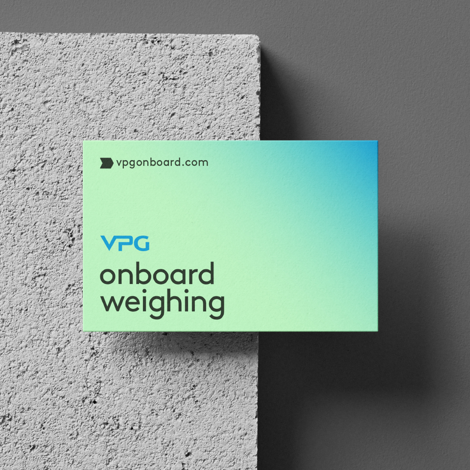
visual_identity
From Engineering Complexity to a Clear Story
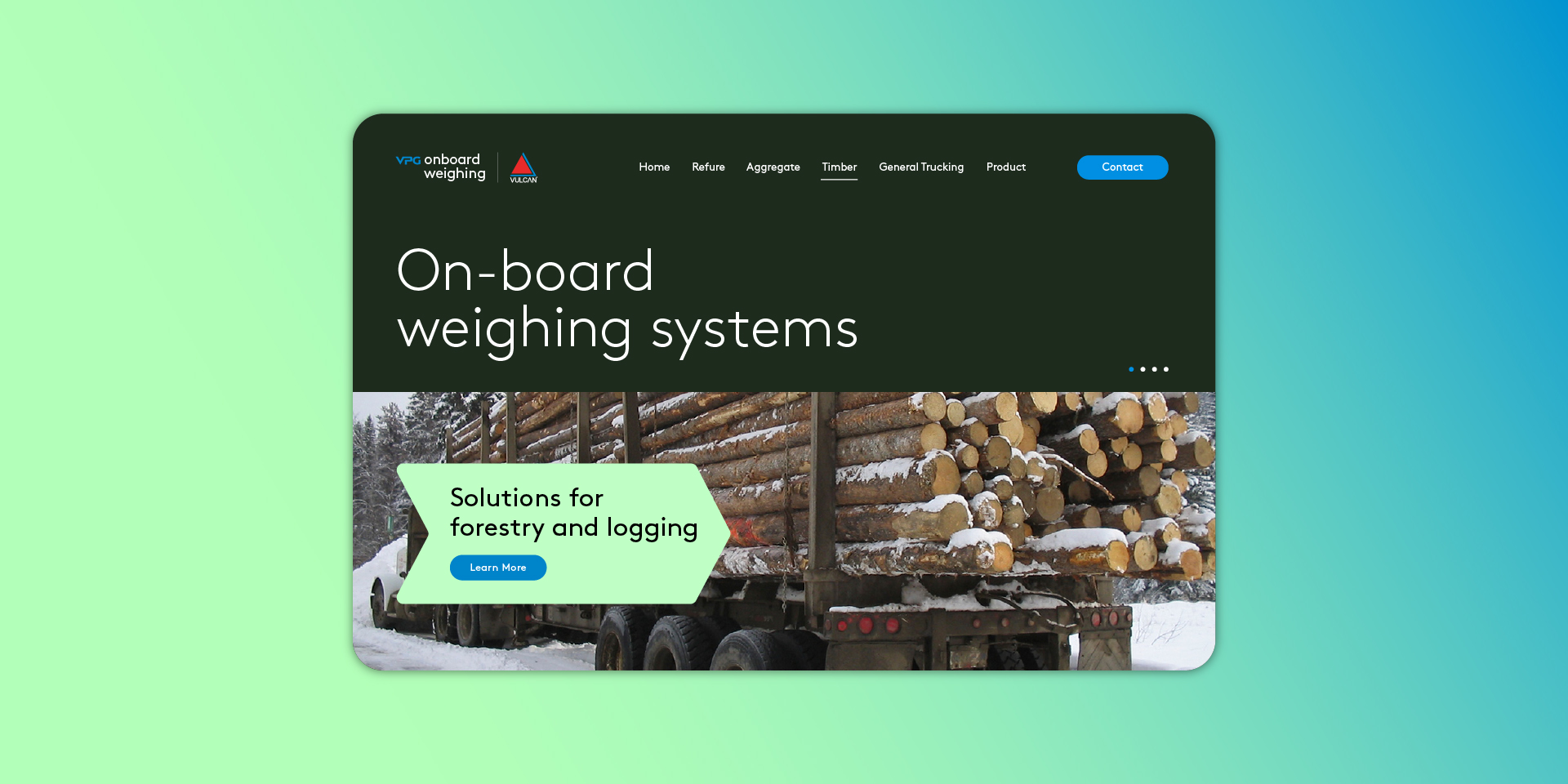
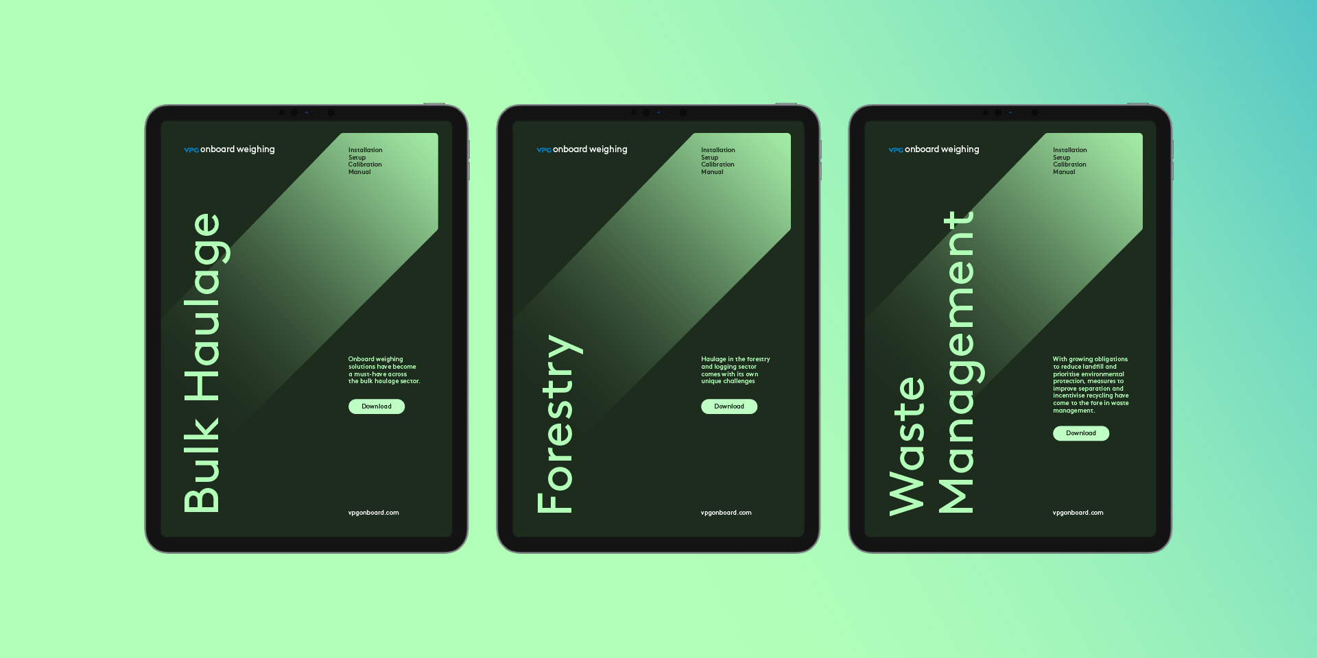
OBW, the On-Board Weighing division of VPG, leads the global market in commercial vehicle weighing solutions. Their goal was ambitious: to turn onboard weighing from an optional add-on into a global safety standard. Our challenge was to distill this technical complexity into a brand identity that is clear, accessible, and distinctive.


Designing a Language of Trust
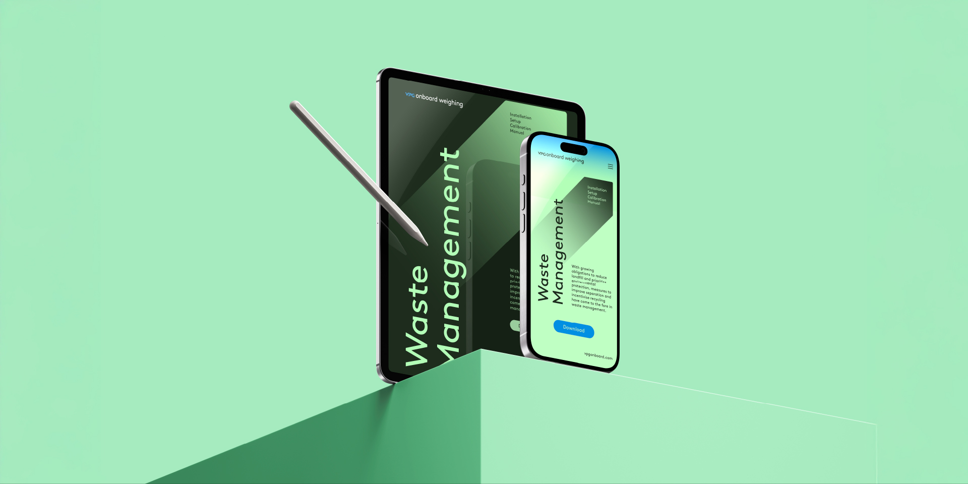
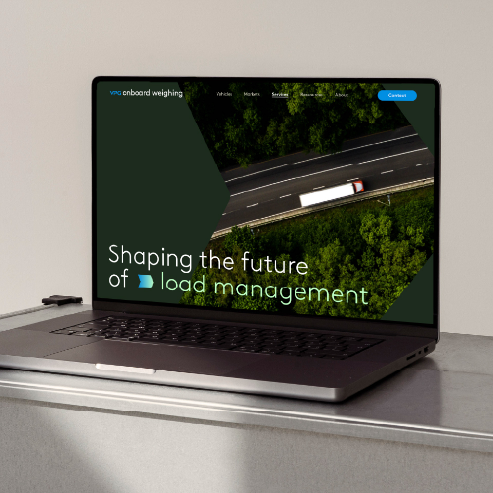
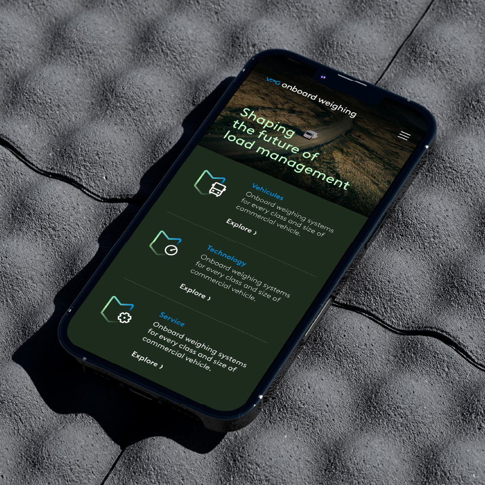
We began by refining the brand story – striking a balance between engineering precision and human accessibility. From there, we built a broad visual language: a green palette symbolizing reliability and innovation, clean and professional typography, and iconography that merges functional clarity with expressive character. At its core, the V-shaped graphic element derived from VPG became a symbol of stability, legacy, and forward momentum. The system was designed to ensure consistency across every brand touchpoint – from digital to exhibitions.

A New Standard for a Global Brand
At the end of the process, OBW emerged with a complete and refined brand language – one that communicates both legacy and innovation. The new identity positions OBW not just as a technology provider, but as a global brand setting the standard for safety in the industry.


