
Client
Bility
Industry
Health | Tech
Skills
website_design | ux_design | ui_design | naming | visual_identity
Human being, Tech doing
It seems humans and technology are only becoming more intertwined. While artificial intelligence is already capable of conducting truly human-like conversations, a range of technologies—including AI, advanced materials, and connectivity—are merging with human life to support and enhance it. Bility, an R&D company in the field of medical and rehabilitation technology, partnered with us to take its groundbreaking work from product to brand. The company is developing a smart prosthetic—currently for the leg—that is entirely unlike any existing options. This prosthesis is highly technological: a meticulous creation from the materials to the structure, the user experience, and the technologies that make it a real breakthrough. Worldwide, the number of medical amputations is steadily increasing, mostly due to diabetes or injuries. Bility offers a solution that not only helps the human body function but truly allows it to flourish again.
Ability to mobility
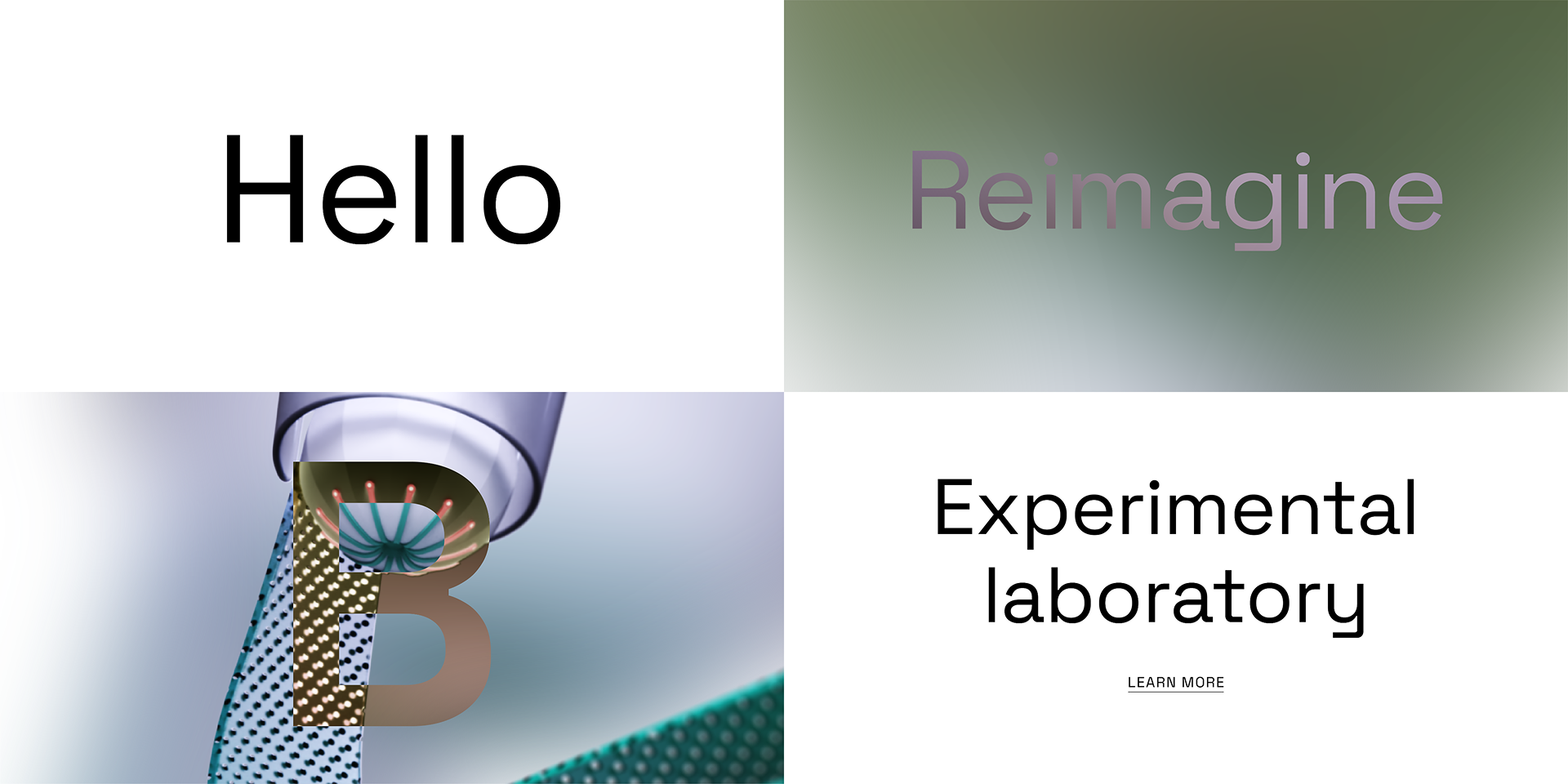
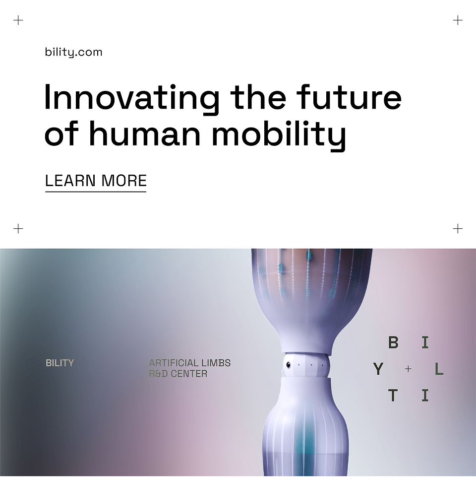
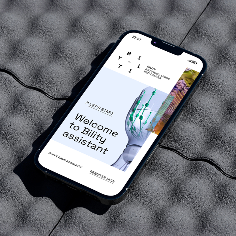
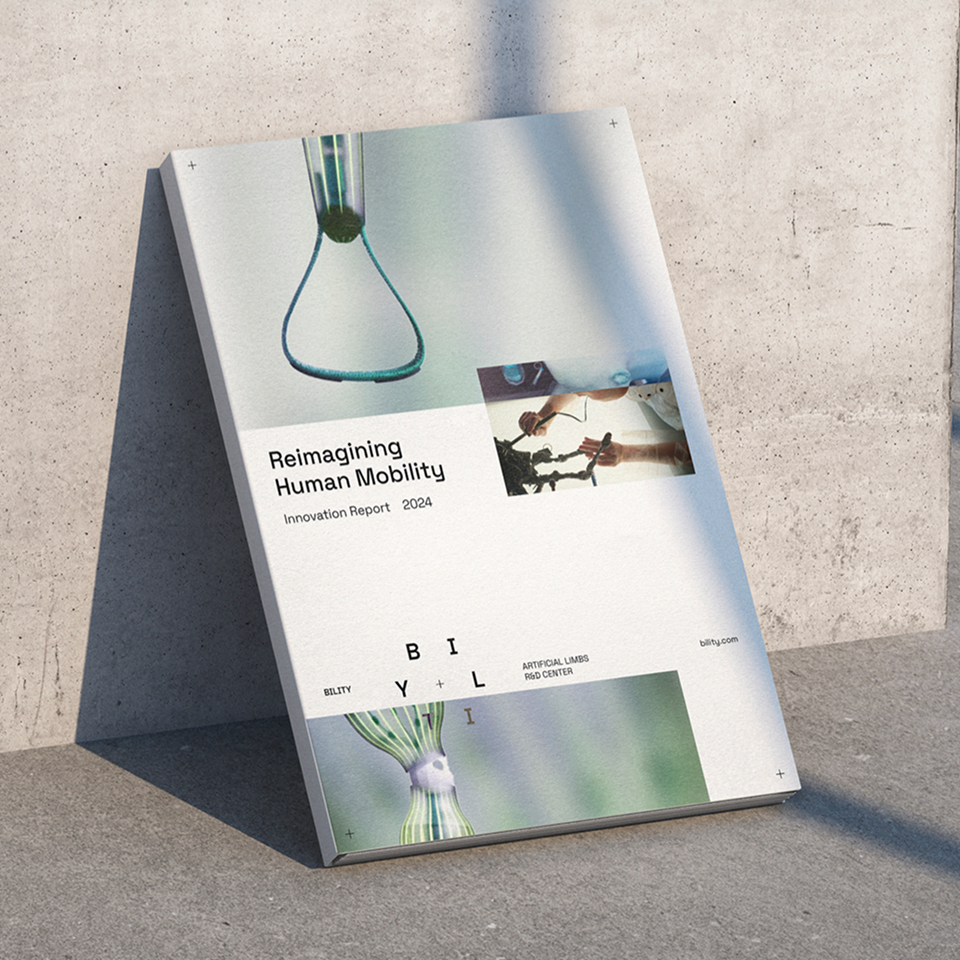
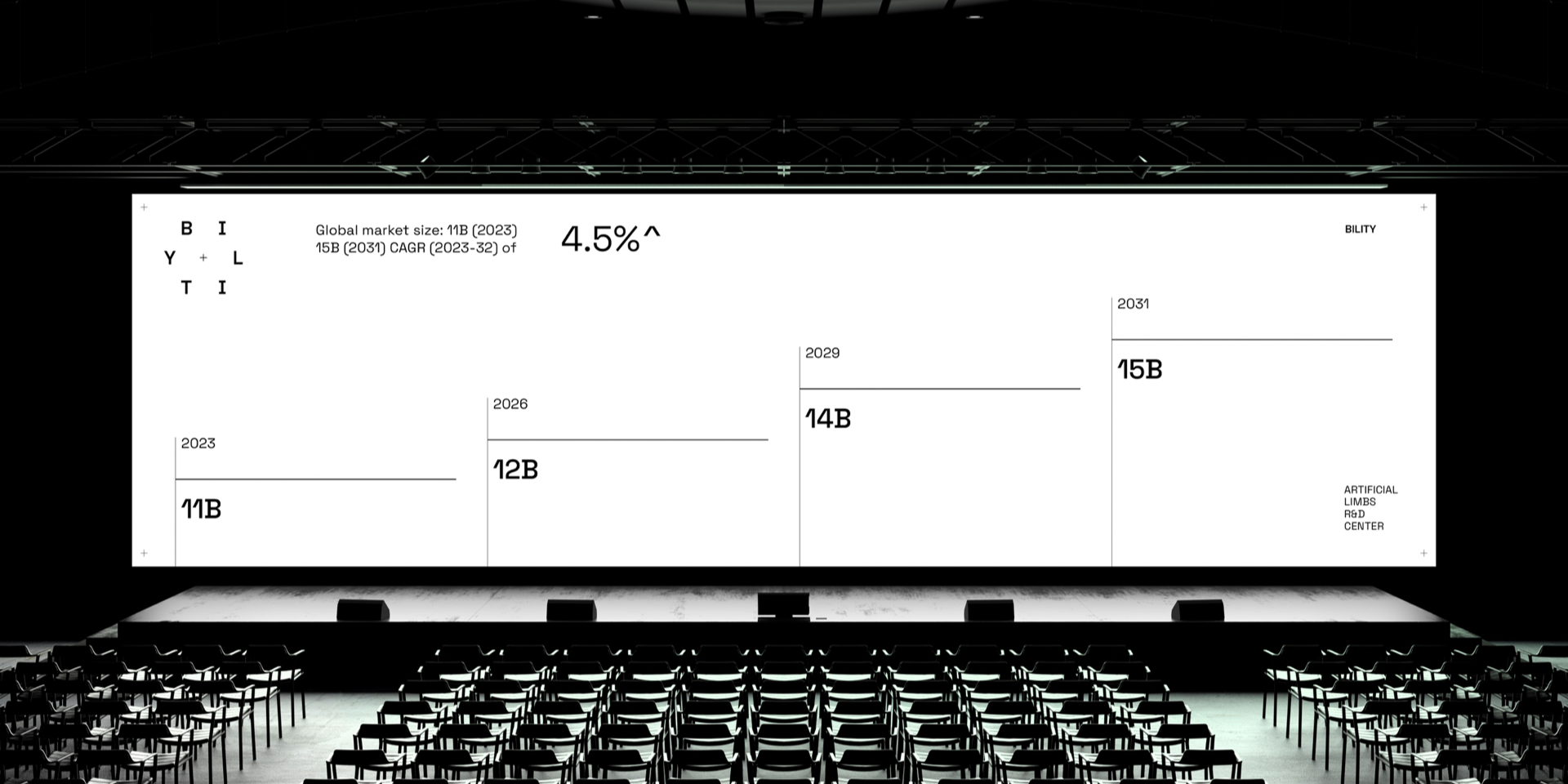
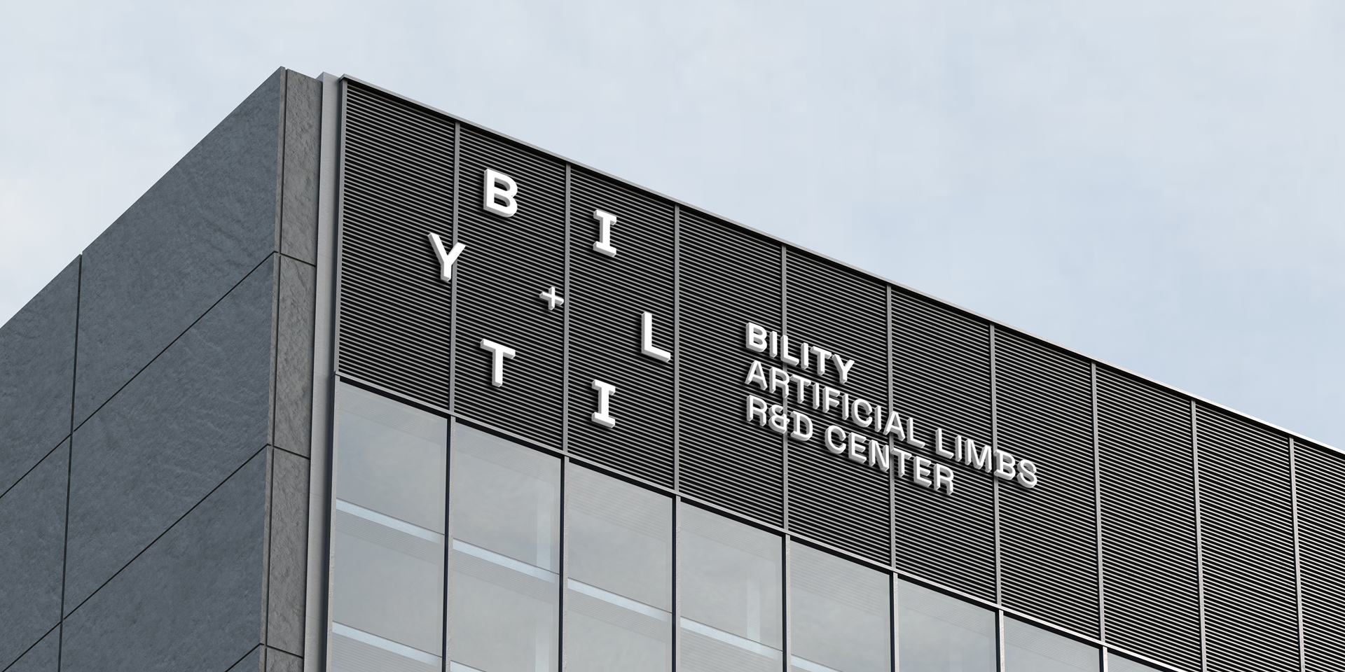
The main goals of this process were to create a visual language for the brand, define the user experience for a digital product, and design it. We distilled the company’s strategy as follows: the new positioning is ARTIFICIAL LIMBS INNOVATION R&D CENTER, and the brand essence is MOTIVATE ANY BODY. Bility is establishing an innovative center that provides solutions for amputees by combining disciplines and research to develop future-ready answers for the diverse challenges they face. They aim to collaborate with partners across fields such as robotics, industrial design, artificial intelligence, and more—so the brand’s essence resonates both with end customers and with potential partners. During the naming process we led, we gave the company the name Bility, inspired by the words ability and mobility, referring to both the capability and the mission to create technological collaborations that improve human capacity and potential. Additionally, as an English suffix, “-bility” transforms nouns into possibilities, bringing ideas into the real world (possibility, credibility, etc.).
A space for imagination
Bility’s new visual language celebrates the space in which human capability can be reimagined through mobility. The logo features the word itself forming a circle, with a plus sign at its center. The color palette is minimal—black and white—to let the photographic language shine. The imagery includes: atmosphere photos presenting technological and biological textures; product photography; images illustrating the connection to the human body. The colors in the images are soft, conveying cleanliness, innovation, and refined power. Layouts are composed of white backgrounds, black text, and photos in free compositions that suggest movement, create room for reimagining, and reference the logo.
Creating through creation
When we set out to design Bility’s new website, we faced several challenges: How to explain Bility’s vision—creating advanced prostheses unlike anything on the market today. How to clarify that this is a center that doesn’t produce them, rather facilitates collaborations with diverse R&D bodies to address amputee challenges in ways that don’t yet exist. How to showcase the various areas of potential collaboration. And how to attract the best organizations capable of developing innovative solutions together. We understood that the most effective way to bring in partners was through the product itself. Therefore, we focused on presenting the vision of the smart prosthesis and all its features—it appears right on the website’s homepage, along with an interactive experience allowing users to learn more about the product and the many possibilities for co-creation.

