
Client
Amisragas
Industry
Industry
Skills
visual_identity | copywriting
For the energy
When you hear the name Amisragas, a clear image likely comes to mind: a long-standing company known for gas solutions. But in reality, Amisragas has already evolved and now offers a wide range of energy solutions. It's interesting to look at the gap that’s formed—between a brand that's a household name and deeply rooted in Israeli culture, and the public’s understanding of its current offerings and development. That very gap is what sparked Amisragas’s new brand journey. After completing a strategic process that redefined its essence, the company came to us to help shape a new visual language for its evolving brand. Additionally, we gave voice to the brand with fresh messaging. This joint effort helped Amisragas close the perception gap, introduce a new narrative, and reconnect with Israeli households in a way that reflects all it now offers.
For peace of mind
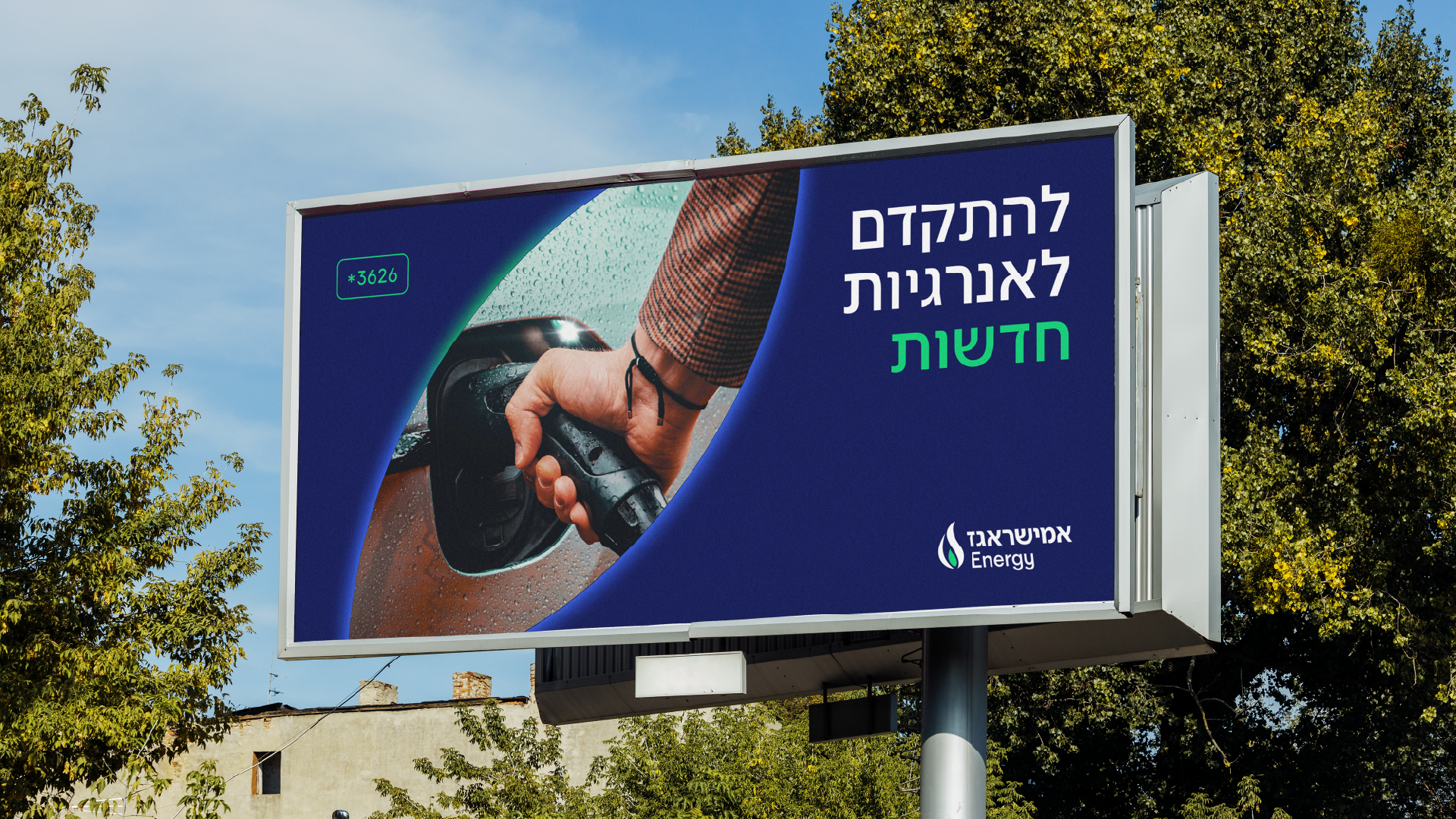
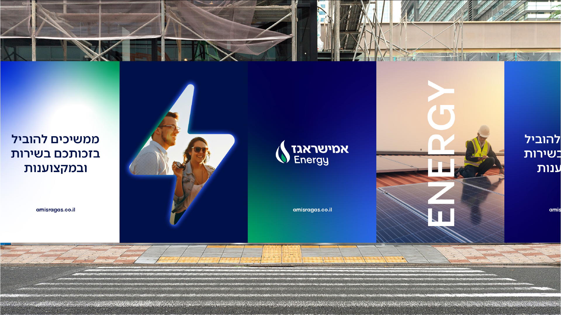
Amisragas’s brand strategy positions it as “Power that creates security.” As a large, experienced, and well-established company, it offers customers a deep sense of security—through its products, their choice to use them, and the company’s long-standing familiarity with Israeli consumers. The brand essence is: “For your peace of mind.” Amisragas is present in nearly every Israeli home, enabling it to provide solutions that support a comfortable life—from a hot shower, to home cooking, to solar energy solutions. The new brand messaging reflects this strategy, with high-level messages aligning to its positioning and essence, and more specific ones built around the brand’s core values: professionalism – highlighting the company’s knowledge, experience, and people; convenience and service – emphasizing the customer experience; and a sense of security – reinforcing the company’s forward-thinking approach and reputation.

For a reshaped brand
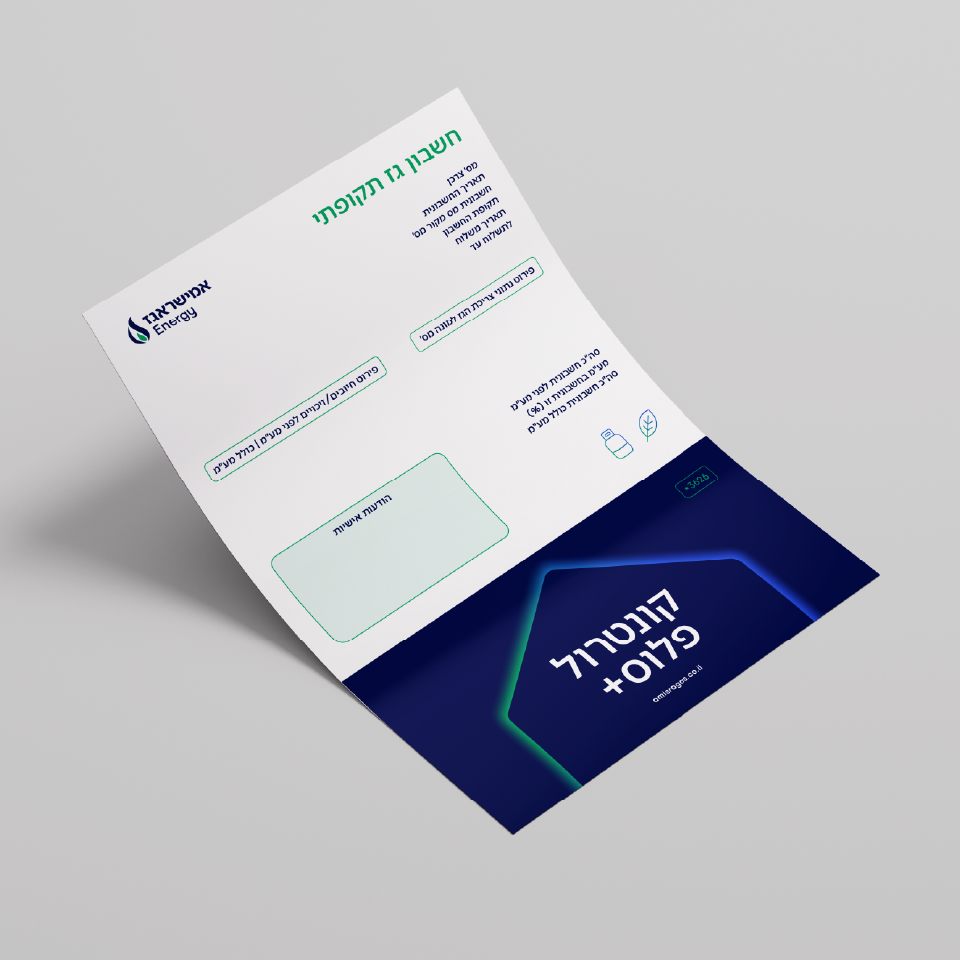
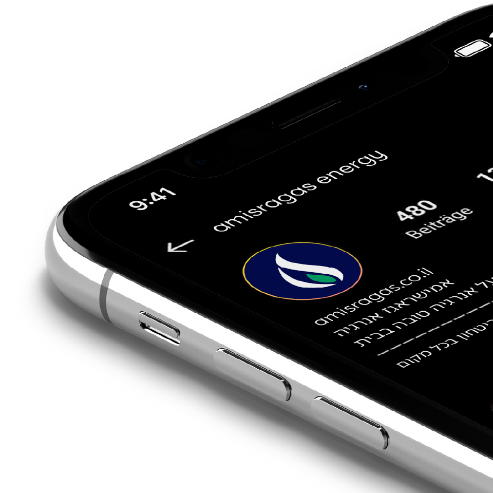
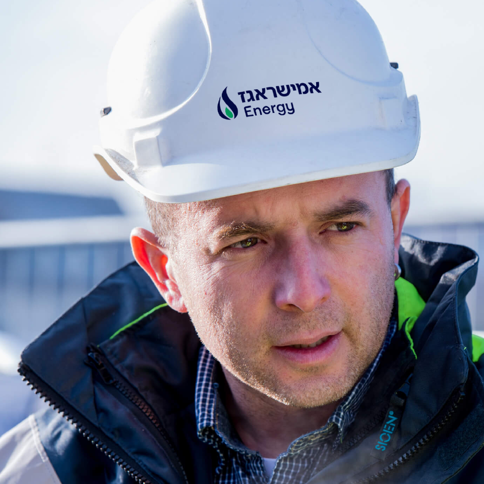
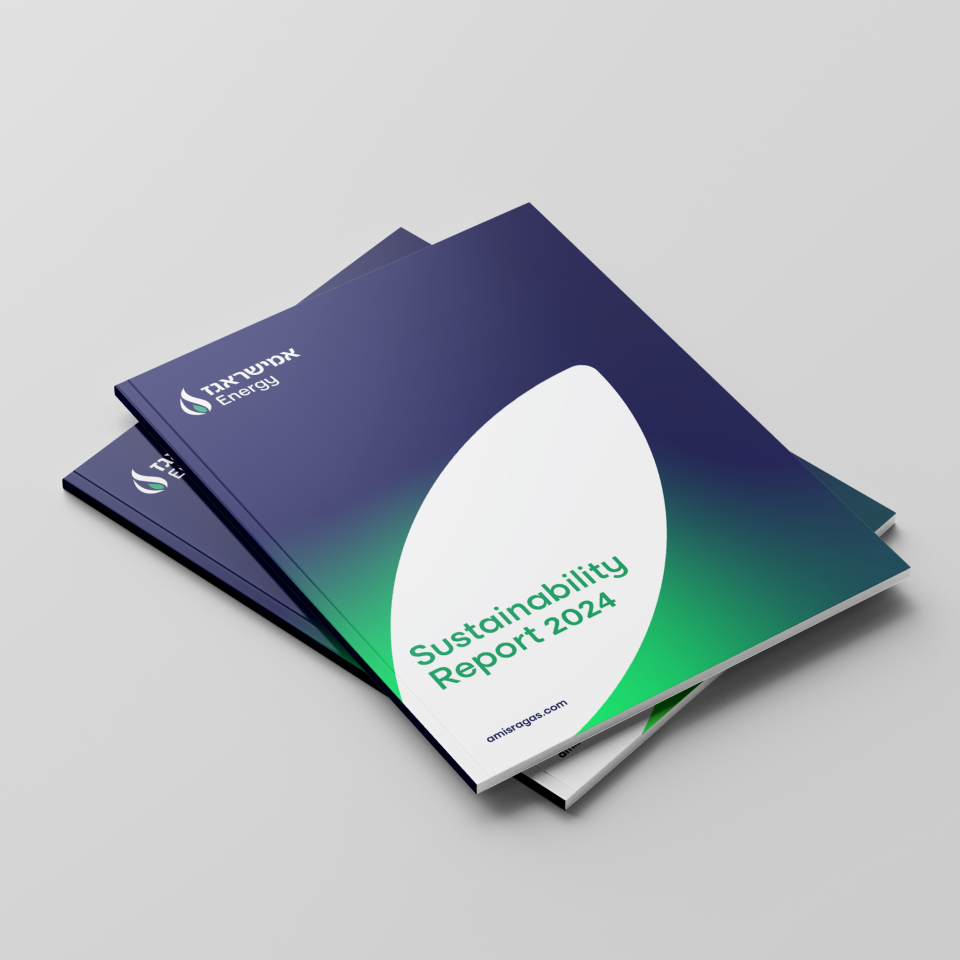
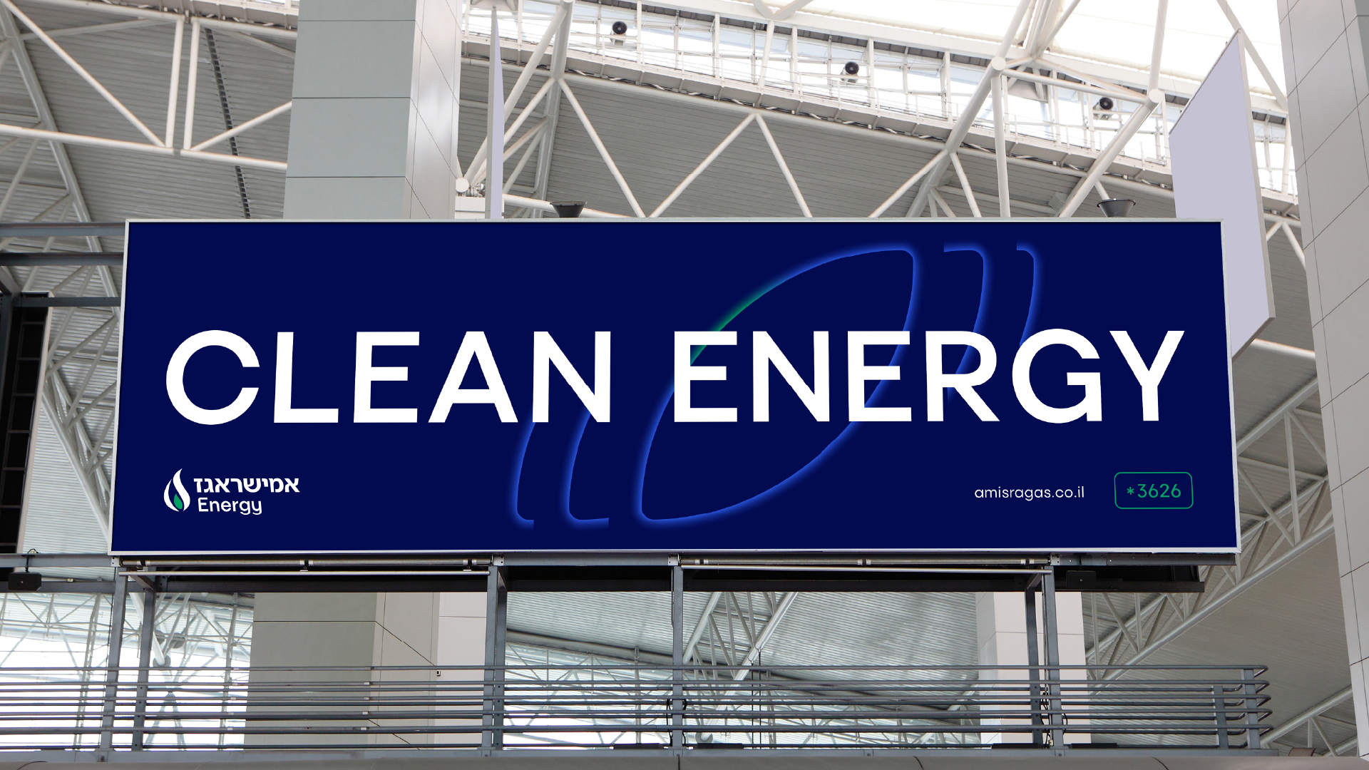
Amisragas’s new visual language references familiar design cues, with a modern twist that brings the brand into a more digital-forward era—while also expressing its new brand strategy. The updated logo projects strength and confidence through its deep blue color and slight forward tilt. The flame icon beside the logo has also been refreshed with softer, rounder shapes that bridge the product and the human experience. The flame’s green core reflects Amisragas’s commitment to natural resources, its place as a natural part of the Israeli fabric, and its ability to support meaningful personal, family, and business moments. As for the brand’s color palette: it now includes deep blue, medium blue, light blue, green, and white—gentle, natural colors that allow the brand to expand into the broader energy space, beyond just “gas” and “fire.” These colors can also appear as gradients. We also designed a new set of icons—more digital, modern, and dynamic. When shown as gradients, they radiate energy. The icon shapes themselves double as graphic elements across different layouts and grids.The brand’s photographic style captures domestic, professional, and business moments—and Amisragas’s role in creating them.


