Client
Keter
Industry
Industry | Retail
Skills
brand_strategy | copywriting | visual_identity
Make the switch
Plastic is one of the most popular materials on earth, used for anything from packaging to medical devices. Plastic is also one of the biggest pollutants of our planet: as of 2025, plastic is responsible for 3%-5% of greenhouse gas emissions, yet production is expected to reach about 450 metric tons—because seriously, we use it for anything. So how can we continue deploying an available source in a responsible, sustainable way? Switching to a recyclable kind of plastic is a good starting point, both for companies who make products and consumers. Keter Group, a big furniture and home décor company that offers plastic made items, is a leader in developing new plastic and using it responsibly. Its sustainability division had turned to us to help to polish is compass and redefine its important role in the world.
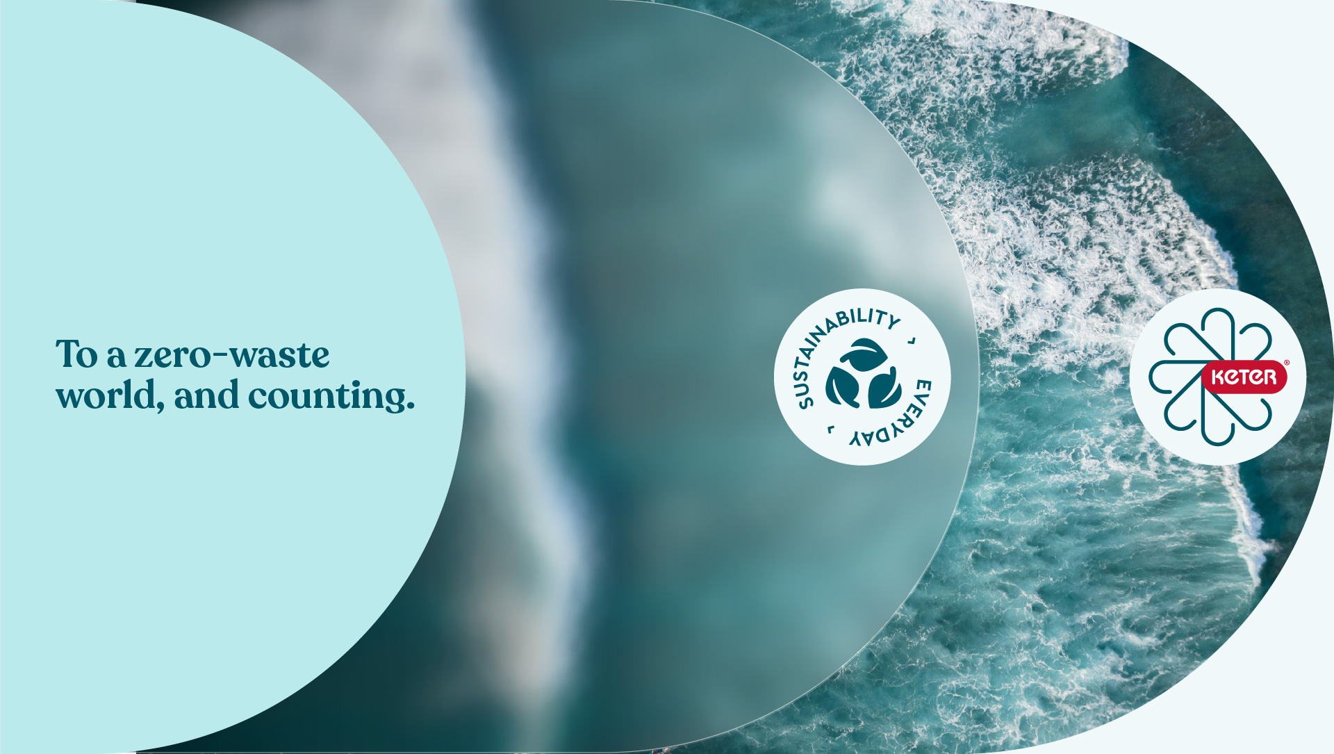

Everybody wins
We embarked on a journey to find the right BCI, Business Core Idea, that’ll guide Keter Sustainability through their constant evolution. It was clear that the main benefit of sustainable choices is the common good—but will their business or corporate clients make the right choice, even if it costs more? The conclusion we arrived at was—yes, it’s totally worth it. What’s good for the planet is good for its people, and what’s good for them, is surely great for business, since businesses can only thrive in a world that thrives. Keter Sustainability’s new BCI is WIN WIN WIN, conveying the deep and meaningful impact of choosing ecological and ethical Keter products. Their new positioning is A CONGLOMERATE THINKING OUTSIDE THE BOX FOR THE COMMON GOOD.
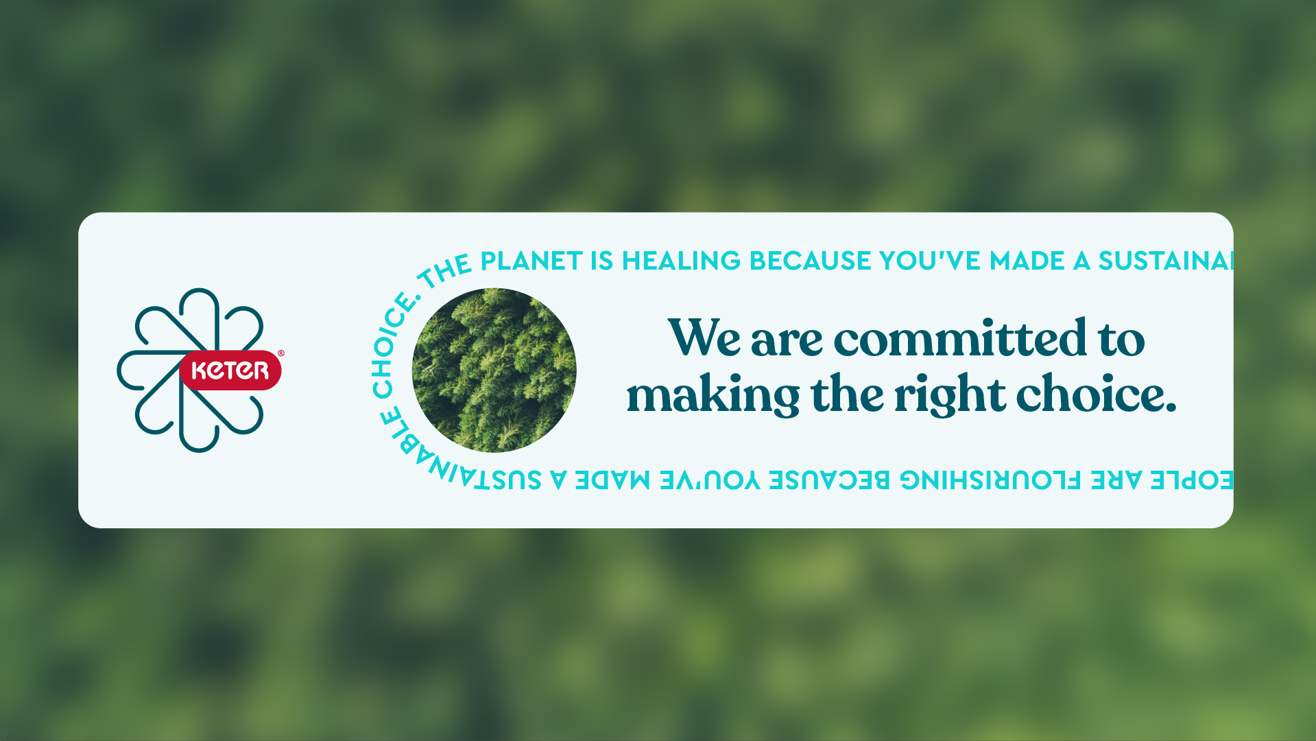
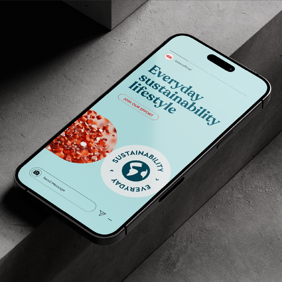
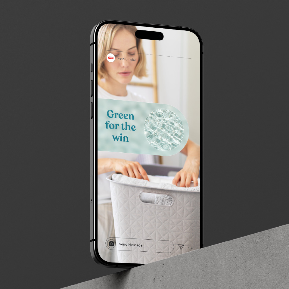
The elements of sustainability
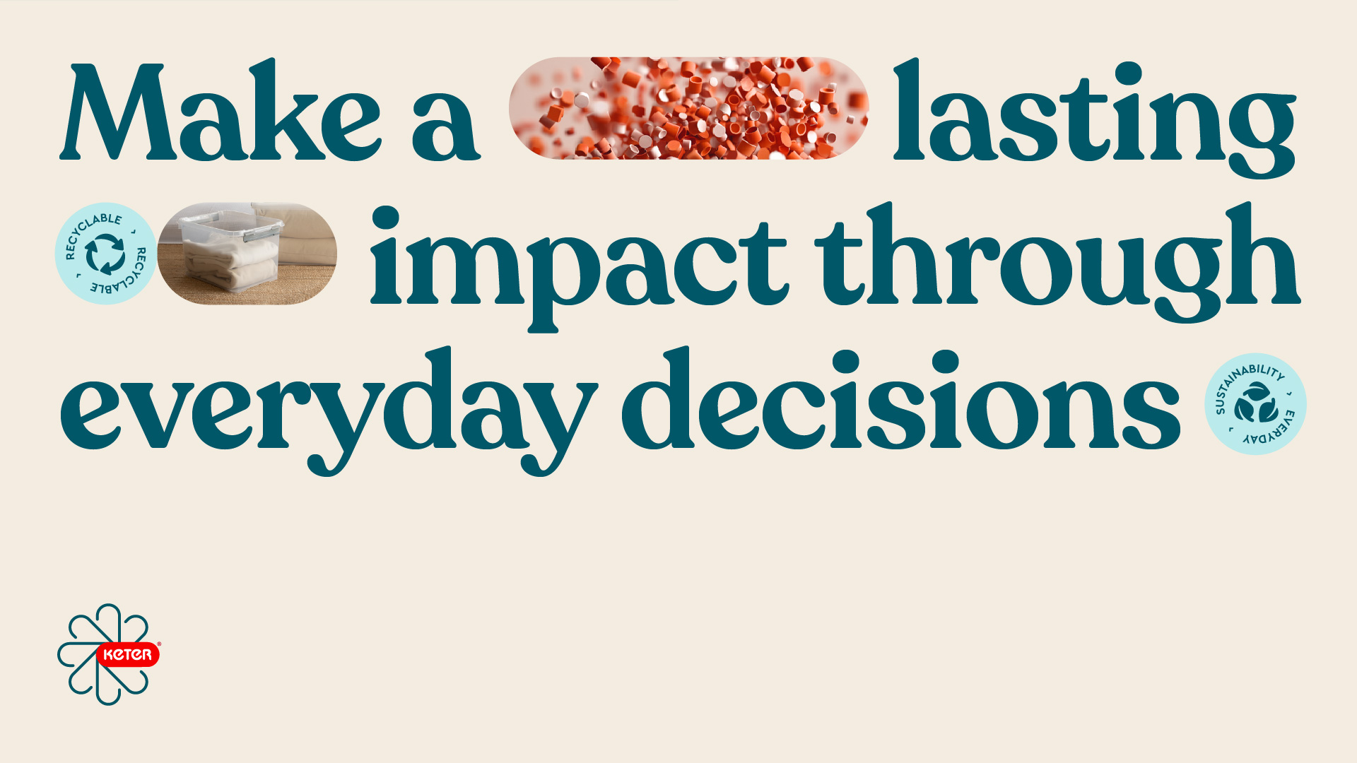
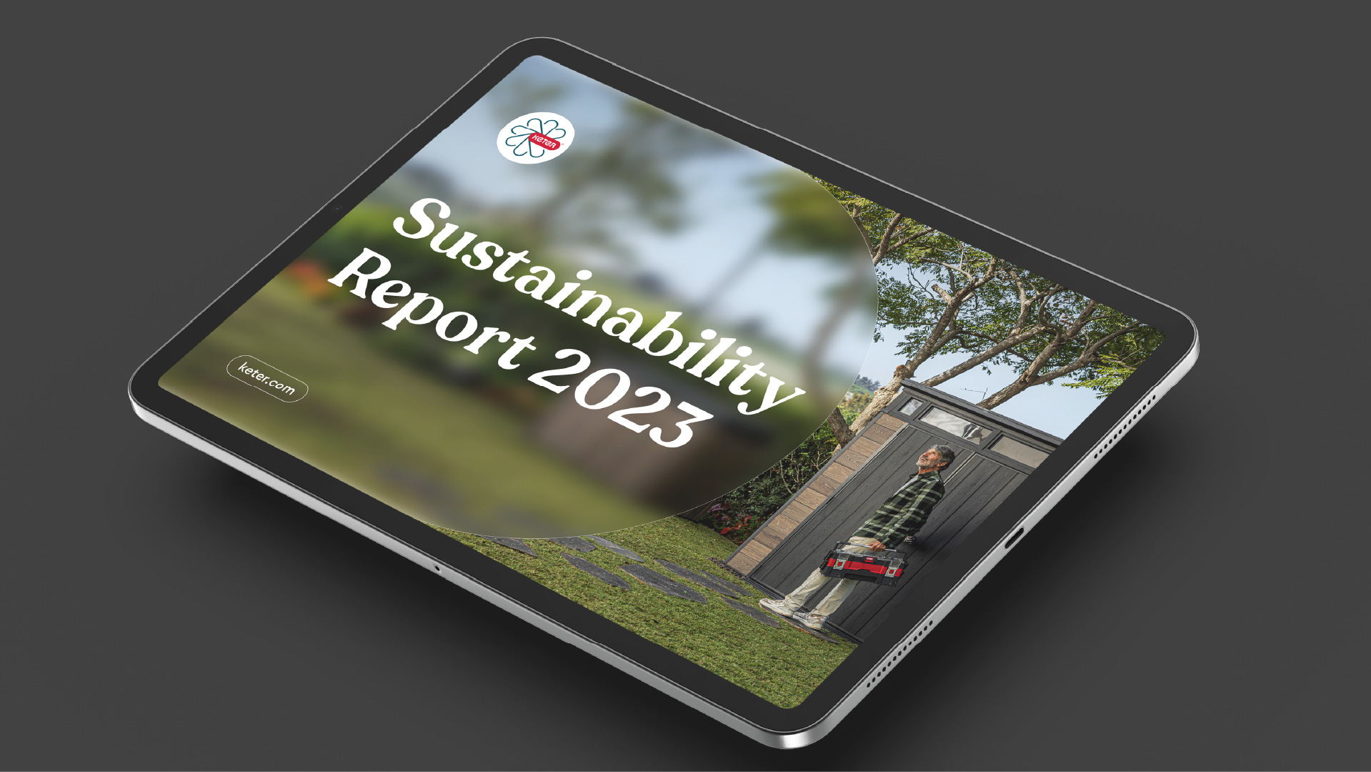
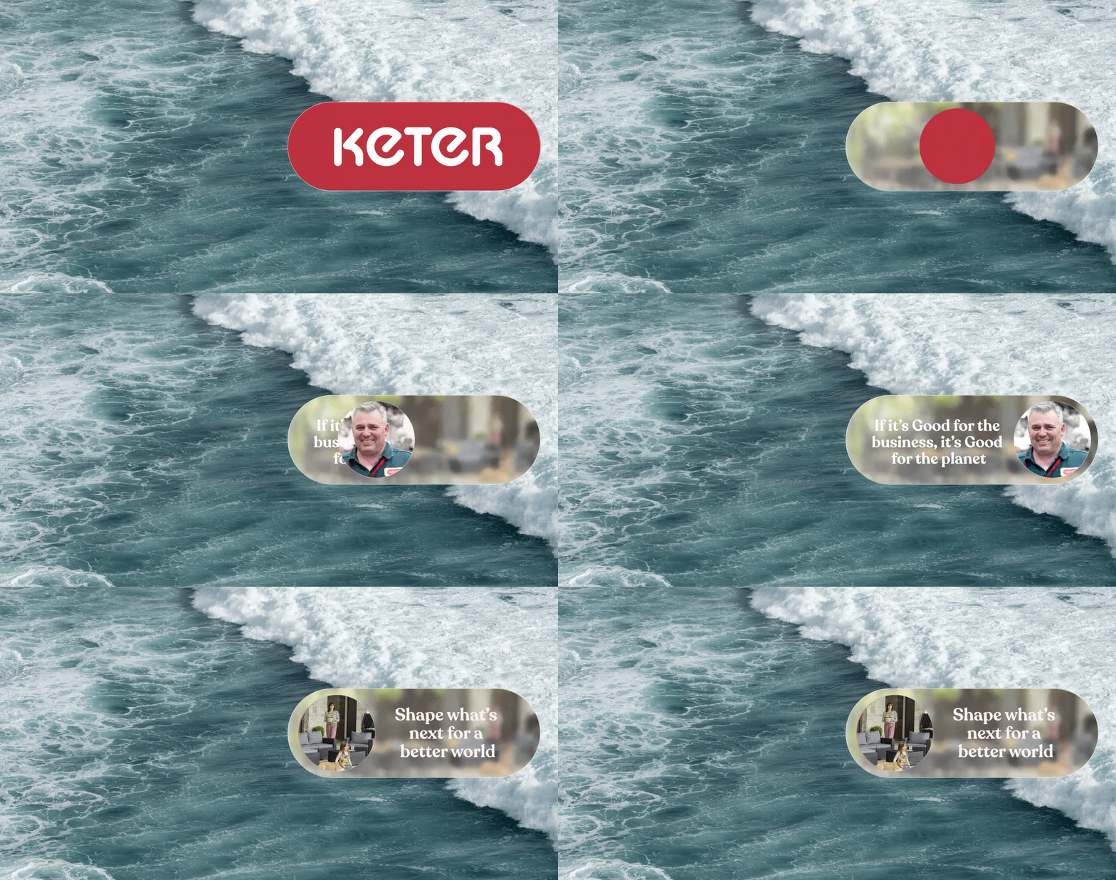
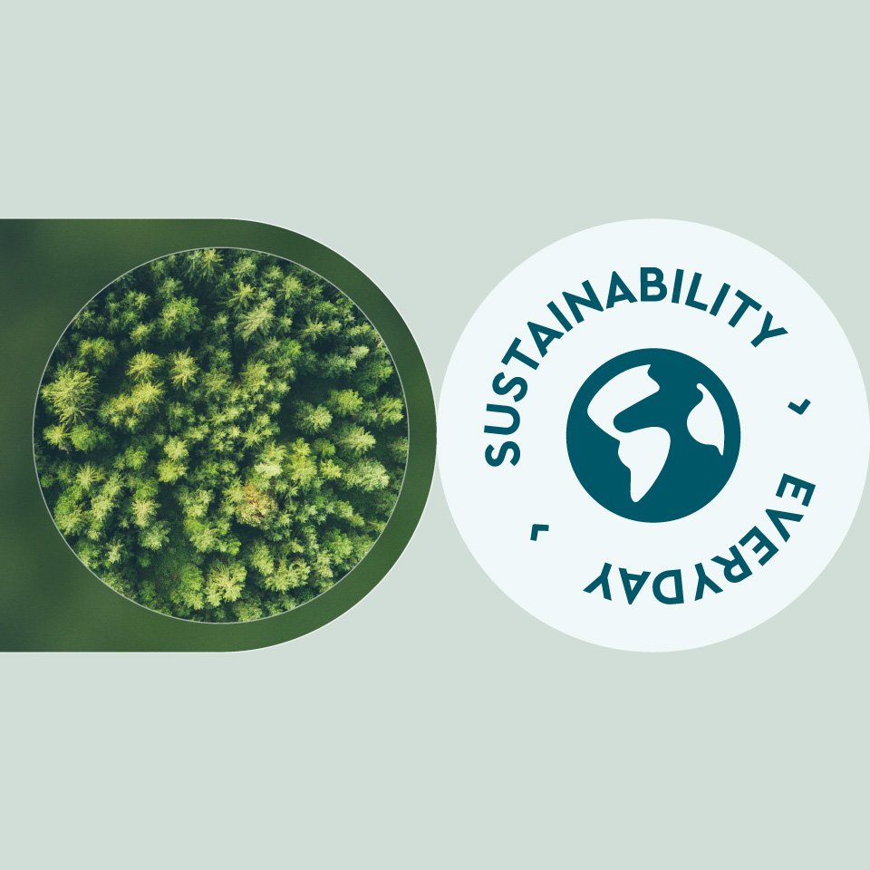
Keter’s new visual language has 6 main principles, from which different elements were born: Core Identity: Circular Energy is conveyed by a capsule shape, referencing Keter’s logo, and symbolizing the company’s continuous efforts toward full sustainability. Dynamic Activation: Movement and Impact, looks like rippled layers and symbolizes the transition from potential to actual sustainability. Clarity of Impact: Transparent Visuals presents a play between blurred and clear appearance. Streamlined Simplicity: Clarifying Complexity shows clear, straightforward graphic elements that stand for the ease and seamlessness of complex processes. Sustainable Design: Aesthetic Appeal is conveyed through aesthetically pleasing, easy on the eyes design, meant to emphasize the beauty of doing the right thing. And last but not least, Holistic Benefits: Win Win Win – a layered aesthetic that includes all elements of the Win Win Win idea, humans, nature and product. While the Keter red is used in the palette, the rest of it uses natural tones, mainly teal alongside coral, turquoise, celadon and limestone, and their light counterparts. Finally, we designed a special stamp that ties it all together. We know, it’s elaborate, but seeing it all together brings Keter Sustainability to life in such ease and grace, makes it so easy and clear that doing the right thing is a total win win win.
