
Client
Swish
Industry
Retail
Skills
brand_strategy | copywriting | visual_identity | website_design | ux_design | ui_design | naming
Give more
Gift and experience platforms—or gifting in general—are many and varied. All of them are filled with compelling value propositions—so how do you create differentiation in a market that, in our warm little country, is already quite crowded? K4A, better known by its marketing name Nofshonit, approached us to help bring clarity to an industry that includes several divisions, identify its most distinctive strengths, and step out into the world with a new name and brand language. The name Nofshonit has accompanied Israelis for decades, in giving between friends, families, and workplaces. But with competitors that wield considerable power, it was time to discover a fresh story to propel the company forward and help sharpen and highlight its many offerings.
Channel your inner Giver
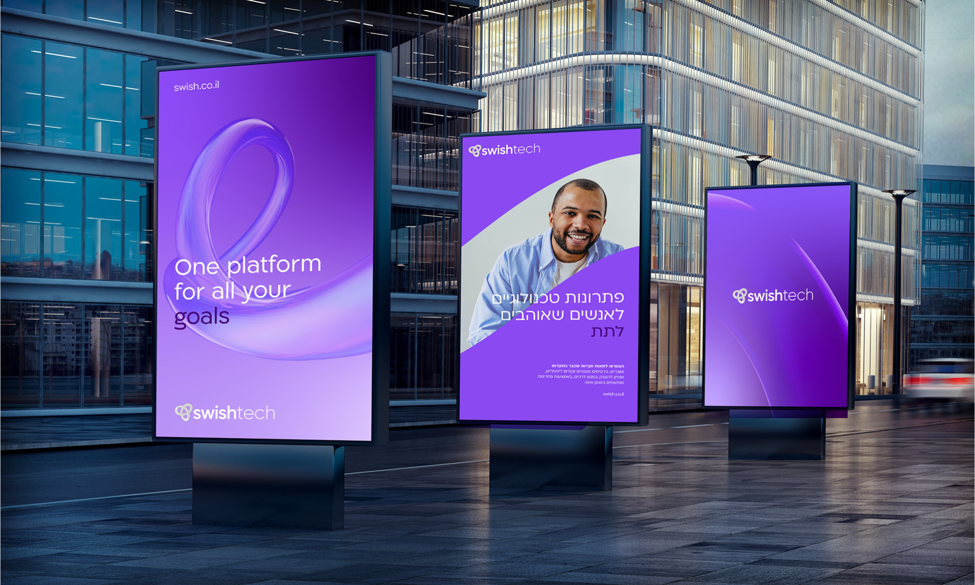
At the heart of the new brand lies a story rooted in the best of Israeli character—warmth, mutuality, generosity—in short: people who love to give. We call them Givers—those for whom giving is truly part of their DNA. They genuinely enjoy offering gifts, seeing it as an integral part of everyday human connection. Givers can also be businesses that understand the importance of giving to employees to express appreciation and recognition. In addition, K4A develops and maintains customer clubs and infrastructures that enable other businesses to establish their own clubs, empowering them to become Givers on their own terms. That’s why the new positioning is LEADING GIVERS PLATFORM—the platform for those who love to give. The new brand essence is EMPOWER BONDING, because giving builds bridges and strengthens relationships—between people, businesses, and everything in between. The brand personality is BONDING CREATORS—a genuine, creative partner with the best intentions. Once we defined the strategy, we chose the new name: Swish—a word that describes smooth, effortless movement, in this case between divisions, between the company and its suppliers and clients, between products, and between businesses and employees. It also contains the word Wish, which resonates beautifully in the world of gifting, fulfillment, and meaningful gestures.
The strongest bond
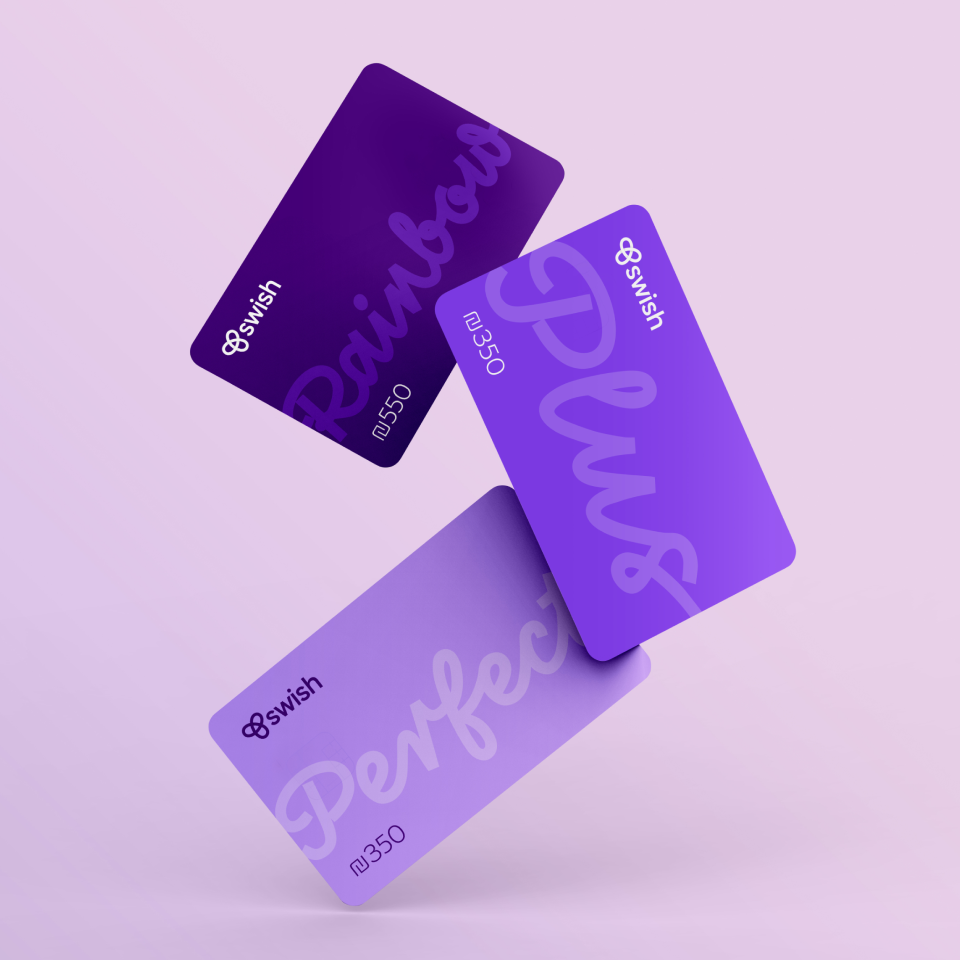
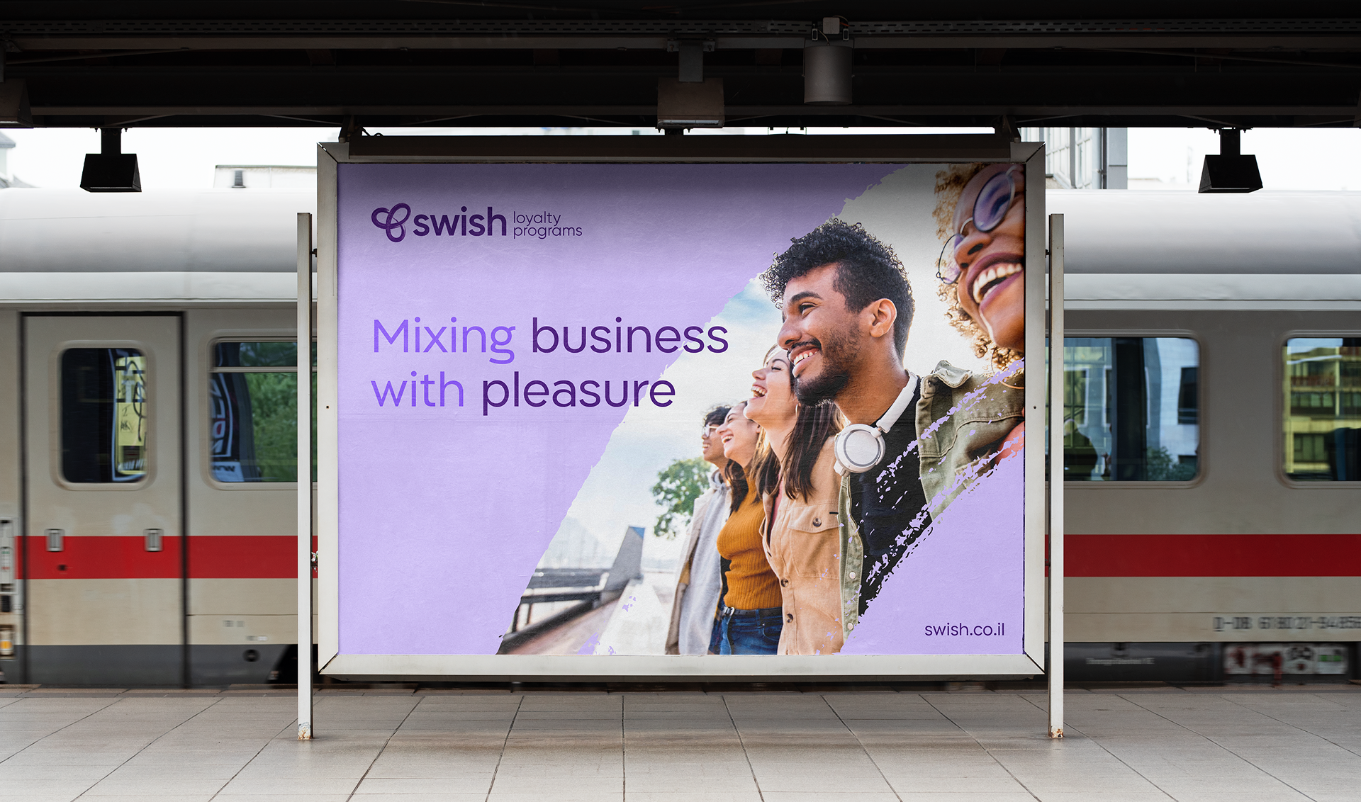
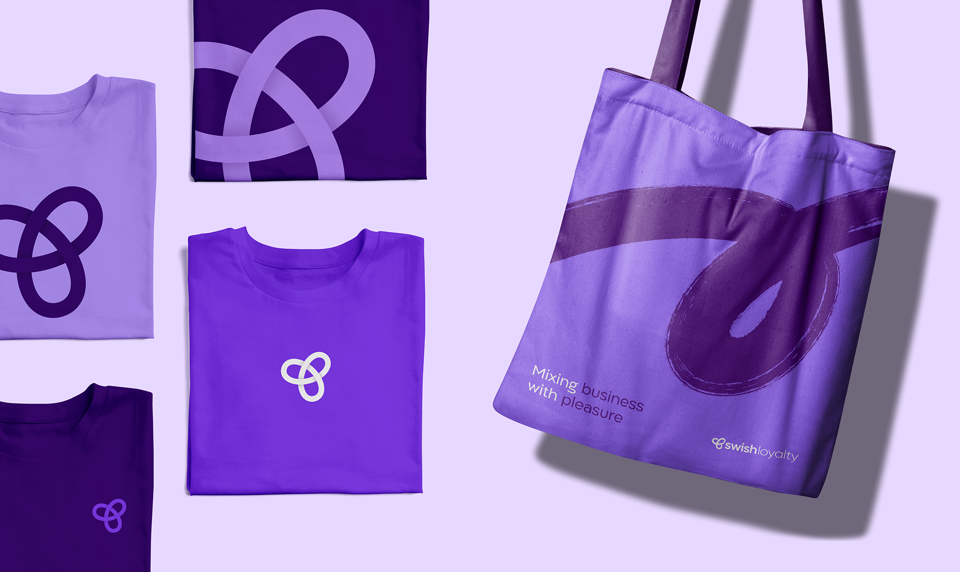
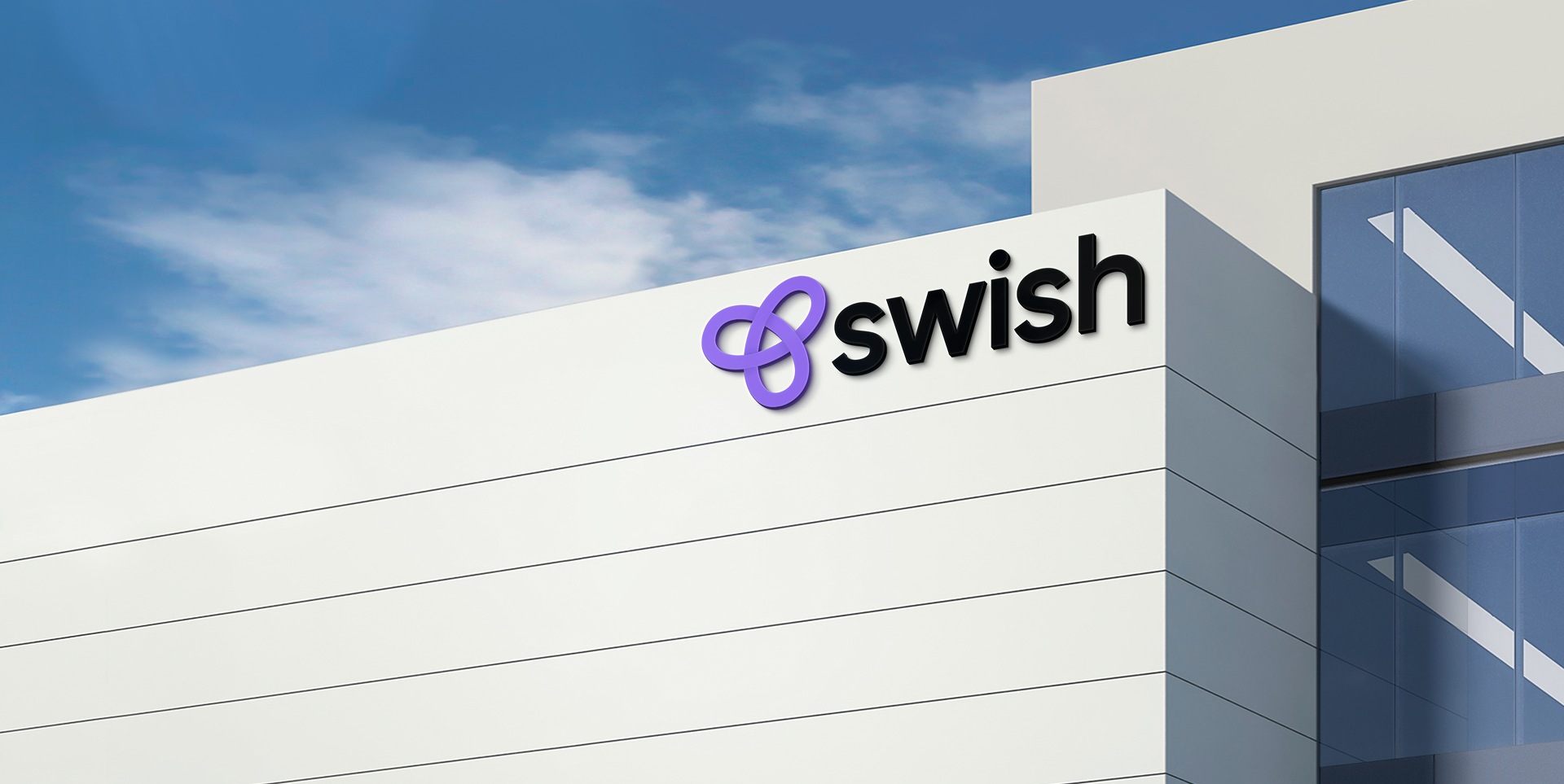
Swish’s new visual language begins with a logo inspired by the Gordian Knot—a strong, unbreakable bond—reflecting the brand’s role as a creator of lasting connections. The logo also highlights the link between the different divisions and the smooth movement among them. The logotype uses lowercase, sans-serif letters to convey simplicity, ease, and digital-first thinking. The brand’s photographic style emphasizes human connection, with images full of optimism and joy, featuring accents of purple. The color palette is built around shades of purple—an indigo-like primary hue, complemented by dark, medium-light, and pastel purples, alongside black and white. Each division received its own distinct visual and color treatment in addition to the core brand palette. For example, the Swish Gifts logo features the Gordian Knot in a purple gradient, with a playful illustrative language that communicates value propositions visually, quickly, and digitally. In Swish Tech, the logo becomes a vibrant 3D shape, and the photography includes calmer office scenes still infused with purple accents. In Swish Loyalty, the logo is rendered in a brushstroke style, like a signature, and the brushstroke itself serves as a brand element. Finally, we developed guidelines for the brand’s verbal identity, providing clarity and examples of how to create bonding through words—using overarching messages and targeted messaging adapted to different audiences and topics.
Simply give
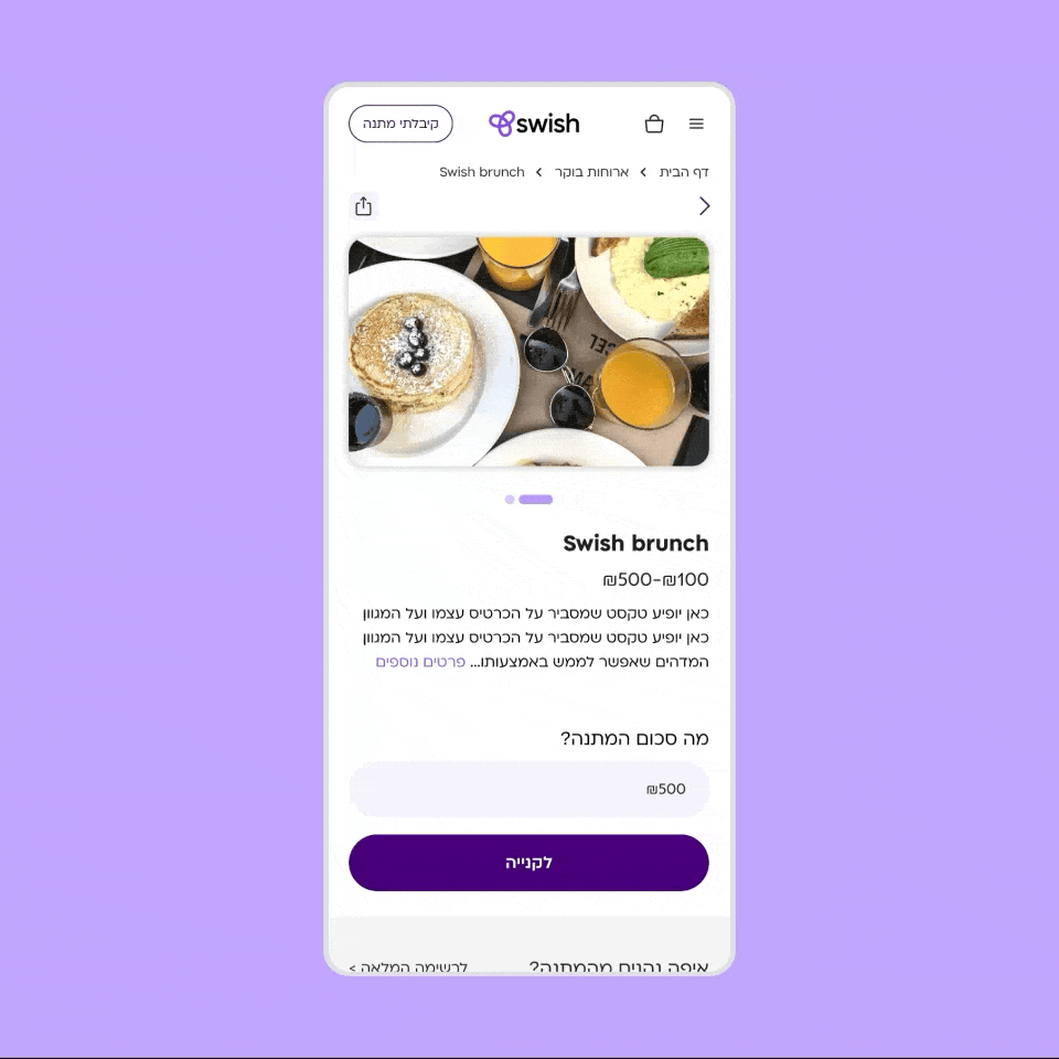
We also designed and built Swish’s gifting system, which functions both as a B2C solution for individuals purchasing gifts through the company’s website, and as a B2B solution for organizations sourcing gifts for their employees. One of the project’s main challenges was combining these two target audiences—private and business customers—under the same platform, while ensuring each would enjoy a tailored user experience. On the B2B side, we addressed a complex purchasing process that includes quote requests and customization steps according to each organization’s needs, designing a clear, accessible, and efficient workflow—even for clients for whom technology isn’t a strong suit. Conversely, on the B2C side, we focused on streamlining the selection and checkout process to make it as smooth, pleasant, and fast as possible. Ultimately, we created a holistic solution that supports both complex organizational processes and simple, friendly direct purchasing for private consumers—all under a unified interface and a consistent, welcoming user experience.

