
Client
Atid
Industry
Education
Skills
brand_strategy | visual_identity | copywriting | ux_design | ui_design
Bridging the Gap
School networks juggle a wide range of stakeholders, each with their own unique needs: students, teachers, principals, parents, and local authorities. Every school stands as its own brand, acting as a community. Yet the education system is hitting some serious roadblocks: students feel disconnected, while teachers and administrators feel frustrated by their limited ability to make real change. In this challenging landscape, education networks need to step up and redefine their purpose - moving beyond just operations to become true drivers of social change. Atid Education Network had already built something special on the ground - a thriving educational community. But they faced a key challenge: while they were making real social impact in practice, their external image didn't reflect this reality, lacking both visibility and a distinct brand identity. Our job was to close this gap and build a brand that captures their true power - a dynamic professional community reshaping Israeli society.

@Atid is the future
Through extensive research, we discovered that the key lies in the unique relationship between individuals and their community. While other educational networks focus on values and excellence, we identified Atid's unique strength in its ability to create "empowering belonging" - a concept where the best way to empower each individual is by strengthening their sense of community belonging, and when people feel they belong, they naturally work to strengthen their community in return.
This insight led to Atid's new positioning as an "Educational Excellence Through Community" education network - one that views each school as a community hub for educational, ethical, and social excellence. The goal is to transform schools into centers of collaborative activity and social initiatives, where different communities actively participate in shaping the educational landscape. This approach positions Atid as a significant force for socio-educational change in Israeli society.

Tagging the Future
In designing the visual language, we faced a dual challenge: creating a brand that conveys the core concept of "empowering belonging" while developing a flexible language that gives each school in the network space for self-expression.
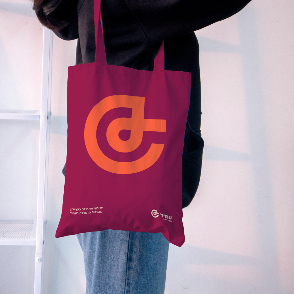
The solution emerged from the logo symbol, built from the Hebrew letter 'Ayin', representing the individual and their ripple effect on the community. The symbol becomes a central tool across the brand's verbal, typographic, and visual language. In verbal and typographic applications, its use as a hashtag allows us to spotlight individuals, highlight success stories, encourage connections, and foster collaboration to empower community members. Through incorporating the symbol into the visual language, we created a memorable and consistent brand. The result is a brand that successfully communicates its values and story while speaking relevantly to all its target audiences.


