

Client
Bank Leumi
Industry
Finance
Skills
app_design | digital_strategy | ui_design | ux_design
Save the update
Our lives in the past decade have been almost fully digitized — even in industries that once relied on consistent in-person presence, like banking. The shift from offline to online results in a rapid pace of consistent renewal: apps are constantly updating — both in their design language and the features and services they offer. Businesses who are looking to keep up must continuously keep up. We’re proud to call Leumi Bank a longtime partner, and to have accompanied the team through years of brand evolution. Most recently, we were asked to update the Leumi app — a process that spanned four years of iterative updates, design refreshes, and ongoing collaboration across a wide range of teams.

Lifetime of experience
In product years, four is practically a lifetime. Nearly every bank has gone through full-scale digitization in recent years. But while you’re busy working on one product, others in the market keep moving forward — so progress must be ongoing, but focused. Throughout the project, we carefully reviewed every UX step, measured ourselves against local and global trends, and asked what could align with current standards — and where we could push boundaries and set new ones. Above all, we aimed to design a user experience that feels both comfortably familiar and meaningfully improved — making every interaction with the brand feel like a pleasant reintroduction. Another key goal was unifying Leumi’s visual language and product suite into a fresh, light, and orderly style — clarifying both the brand and the experience.
Orderly convenient
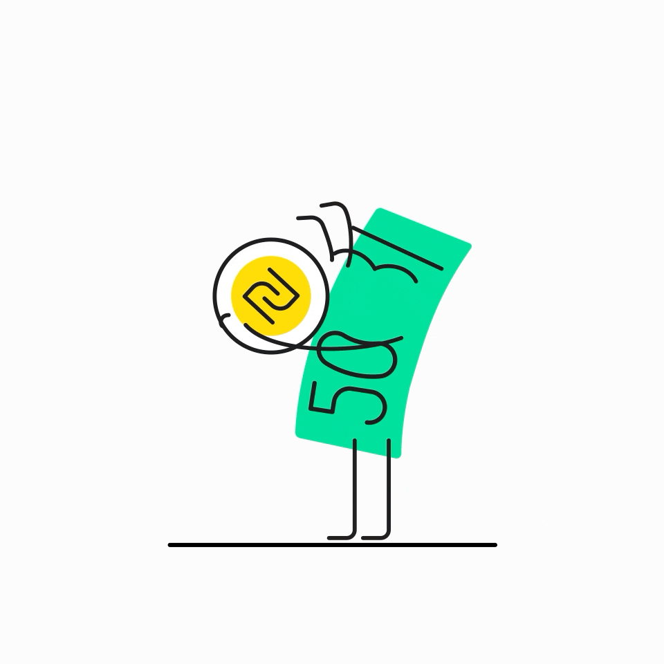
The project transitioned to Figma, a platform that has dramatically enhanced the team’s ability to collaborate and streamline workflows. In Figma, we built a complete design system for the new Leumi app — covering everything from font to icons, hierarchies to color palettes. This’ll help Leumi teams work smoothly with developers and product managers, ensuring a consistent language across the bank’s digital offerings. Among the many additions to the app are new features and user flows — including a particularly complex one for loans. Leumi is the only bank that allows users to split a single loan into three, making this flow unique. The color palette has also evolved: Leumi blue is now vibrant, and softer palette have been introduced to create a lighter, friendlier feel. For example, the once colorful product list (aptly nicknamed the "Christmas tree") now presents a cleaner, more unified look that’s easier on the eyes. Typography and spacing have been updated to match evolving design trends, creating a more pleasant experience overall. Numbers are now larger and bolder, making important information instantly clear. Toast notifications at the bottom of the screen have been color-coded by function: red for errors, green for confirmation, and Leumi blue for general messages. Lastly, the app’s animations have shifted from colorful gradients to a style we call “blob-line”: simple to implement and recreate, visually light, and full of charm. This playful style laid the foundation for new icons and friendly characters — like an illustrated coins and notes — that add personality to the brand.
