
Client
Hexa
Industry
Retail | Tech
Skills
visual_identity | motion_design | ux_design | ui_design | website_design

It's exactly what I never wanted
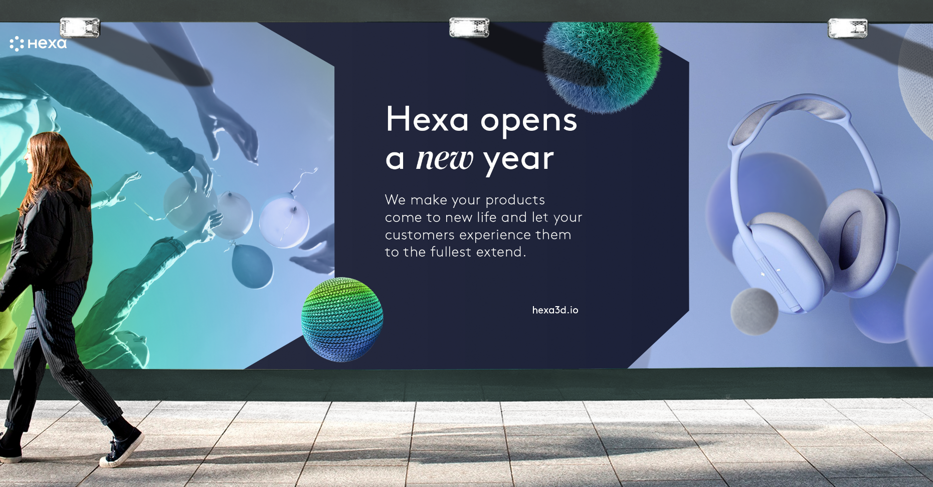
Buyer’s remorse. We’ve all been victims of it. No matter how many pictures we saw, no matter how much we imagined it, the reality of the situation just doesn’t always work. In an age where online shopping for just about anything is a way of life and reliability is sometimes a stretch, Hexa came up with the perfect solution: a powerful augmented reality software that allows consumers to see exactly what they’re about to buy in full 3D form before they buy it. We were tasked with creating an exciting look for Hexa, and this is how we did it.
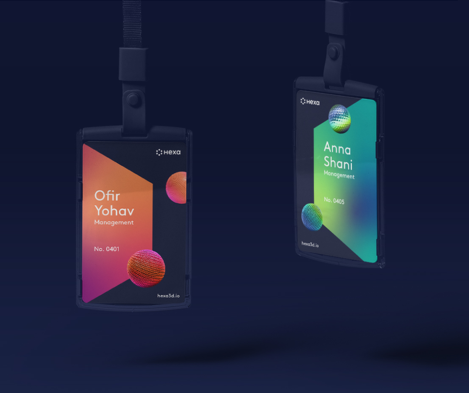
3D ID
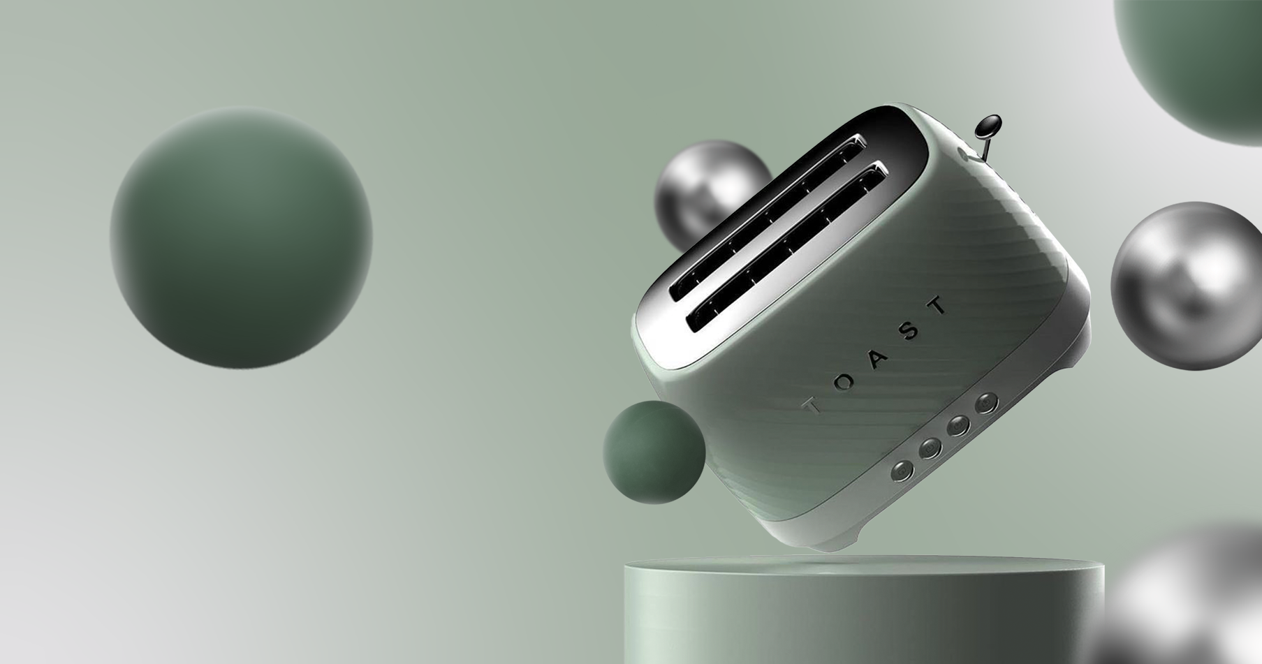
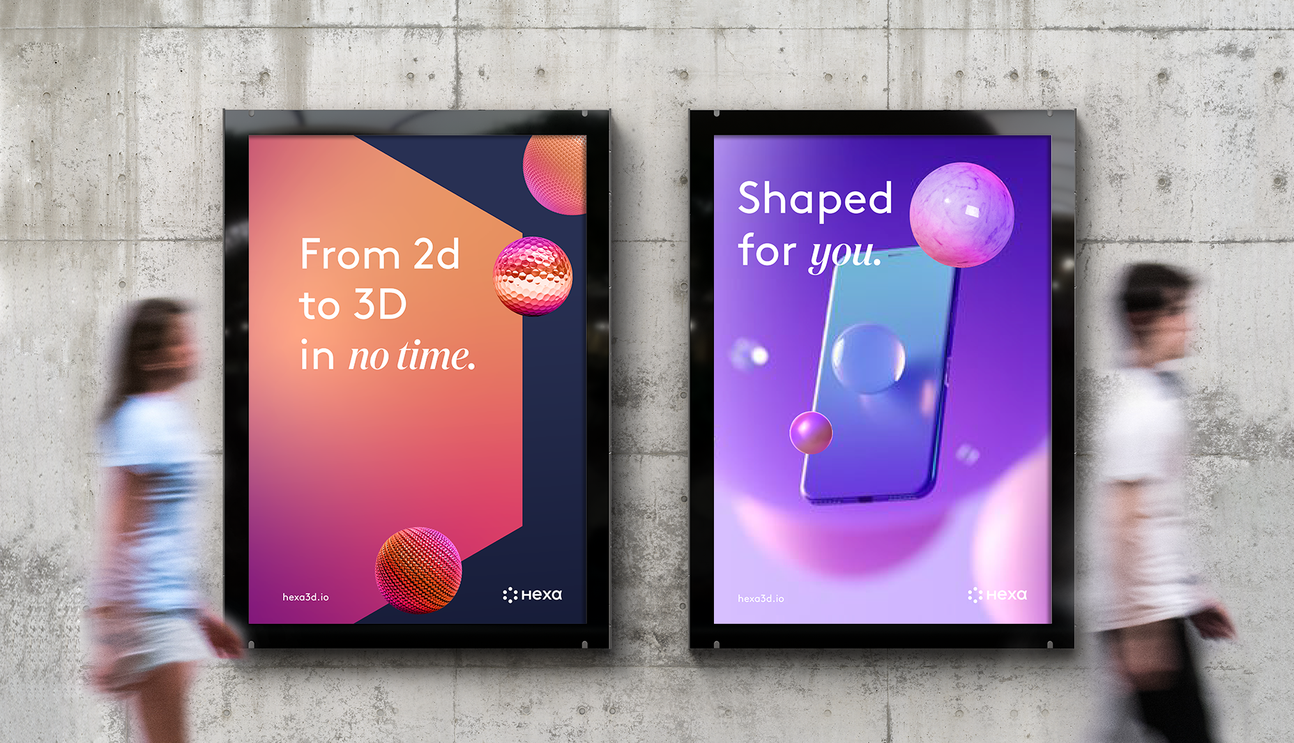
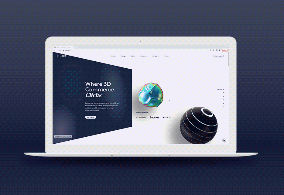
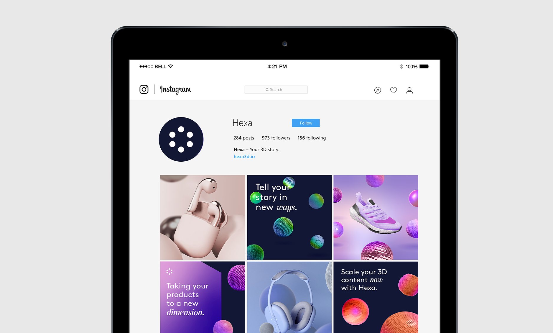
We created a full visual language that best reflected their advanced 3D technology and how they use it to elevate product visualization. The design language had to tell the story of how Hexa beautifully integrates object and environment. Symbols, graphics, and colors had to simultaneously blend together, while also appear separate.

Feel the real
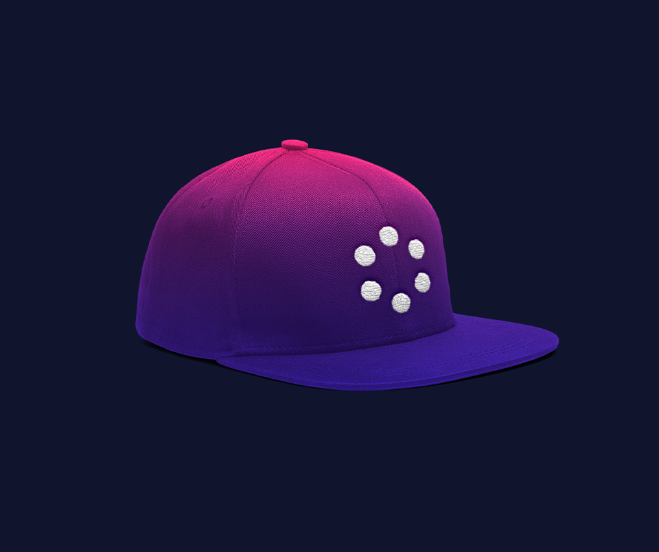
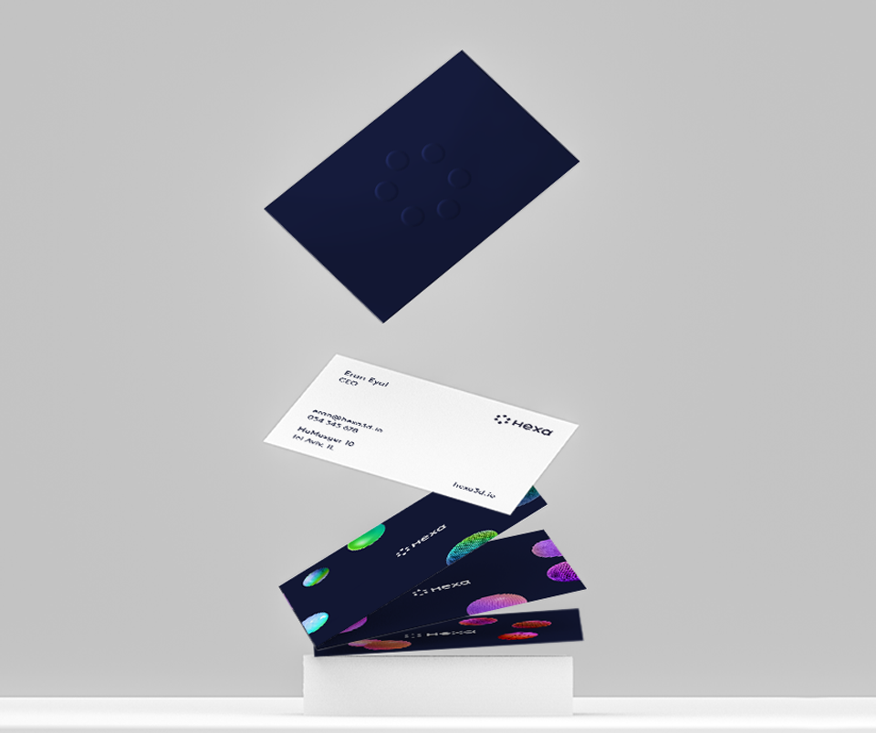
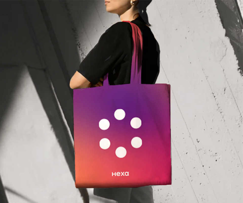
Using varied 3D graphic elements, we conveyed the vast capabilities of Hexa through different textures such as stone, knitted, and grassy. When it came to the gradient, greens, purples and oranges were selected for Hexa’s identifying look, with each palette consisting of three main colors taken from the gradient.
Lastly, we brought movement to the website by incorporating micro animations. As you scroll through the site, shapes appear, and disappear graphics hover and move about, all of it giving a dynamic feel that you control, and the sense of the virtual and the real co-existing.

