
By Yehoram Davidi, Hadas Sadeh
Fight, Flight or Share
Mass shooting or a deadly tsunami have a shocking impact, in more than one way. In a matter of minutes, dozens of live videos are broadcast in all social platforms.
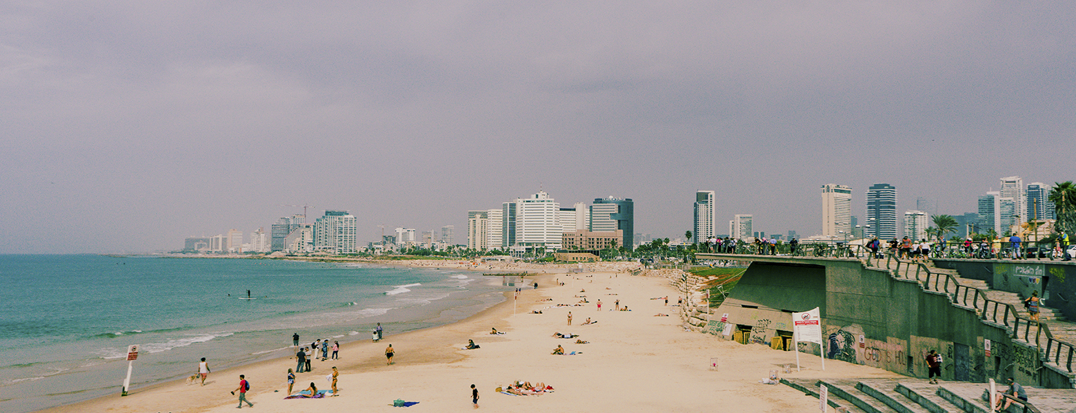
Read MoreOn May 12 2018, Netta Barzilay took over the Eurovision stage in Lisbon, Portugal, and won hearts all across Europe. Kapara Alayich, Netta! (I couldn’t resist the reference). Along with social justice and national pride, Barzilay’s victory ensured that the next Eurovision will set stage in Israel. What does that have to do with user experience? Let’s dive right in while gracefully setting aside a different discussion regarding the hosting city – to recap: out of four major cities, my hometown was chosen, the undisputed cultural capital of the Middle East, Tel Aviv.
At number seven, Tel Aviv is one of the most visited destinations in Europe. In the passing year alone, the number of visitors skyrocketed by 21% and got to a whooping 1.8 million. Its soaring popularity and promising predictions for tens of thousands of Eurovision visitors, prompted Tel Aviv Jaffa municipality to execute one of its greatest ideas yet: Tel Aviv’s very own visitor interface.
#Goals
This project was kicked off with the purpose of building an interactive, modern interface that will lead and assist visitors in the city. We wanted it to be informative, but also for it to function as a significant tool that has the visitor’s back through every part of the journey, from planning, to ordering tickets and throughout their stay in Tel Aviv. We saw it as an opportunity to improve visitor-oriented services and strengthening the connection and trust between Tel Aviv municipality and its guests.
Challenges
Every experience design project begins with a set of challenges we have to consider and grow form, prior to initial research and actual work. These were our challenges:
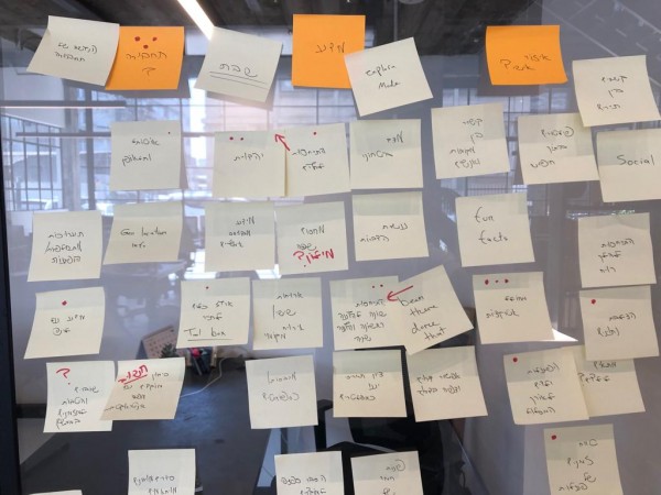
Research
After setting a goal and defining the expected challenges, we began our comprehensive research. This included:
Audience and motivations research
Since our audience is vast and varied, in different ages and with distinctive needs, we strategically decided to put less emphasis on demographics, and rather concentrate on behavioral qualities, associations and scenarios. We’ve created an individual persona for every plot and defined their needs, expectations and fears. The analytic data of former visitors had helped us decide which scenarios are useful to practice. The personas included a returning guest, vacation with children, business trip, LGBTQ, etc. Defining these factors was a basic step in realizing the meaning of our platform for the average tourist’s experience, and planning a wider range of solutions.
Interviews with potential users
The first step was guerrilla interviews with random visitors around the city. We made a point to include as diverse a range as possible, to really paint an authentic picture that shows every need and challenge a Tel Avivian vacation summons. This is what we concluded:
Design concept and principles
The research process had helped us define a set of values from which the UX and UI will stem and grow.
We set out to redefine how people consume their information about Tel Aviv, and change the way they travel the city. Hence our take is One Stop Shop: an interface that travels with the traveler, from planning to getting around, and will function as an authority on everything Tel Aviv before visitors even get here. The interface speaks to everyone, and at the same time, creates a personal, updated experience.
How do we go about it?
Ideation
Following the values we carved out and the design concept, we gathered for an ideation session. The idea behind it (is that even a pun?) was to help us decide on the best way to express the values we agreed upon, in a digital interface. We came up with about 50 optional features, then combed through everything with the client, and sorted the final results by sustainability and compatibility with the first step.
Wireframing
Main navigation
The way we explore an interface reflects quite directly a stream of thought, so it has to be intuitive an on point. Our next step was setting up the initial structure of both the interface and navigation. This is the best partition we came up with:
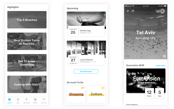
Homepage. A Discover page, featuring a feed in which we can present the users with the most relevant content, while encouraging them to further explore.
Guide. Just like a tourist guide. A toolbox containing general and useful info.
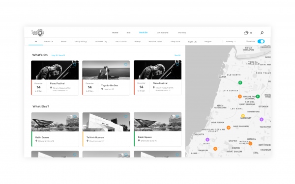
See and do. Every attraction, point of interest, sight-seeing, show, exhibit and event, in one place – and on an interactive map too, to encourage further exploration.
Move. This is an example for a change encouraged by the client. We initially placed this feature as part of the homepage feed, but Tel Aviv municipality had made us realize that this is quite an issue – therefore, we added it to the main menu.
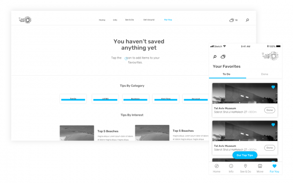
For you. A personal area featuring settings, personalized tips and recommendations.
Discover
This page is like a taste menu. It presents bits of different pages and allows the user to quickly and conveniently hop over to other sections in the interface, that they define as important. During research we found that most users could use some help in decision making – so this page, which designed especially for those times when you just can make up your mind, is a perfect welcome.
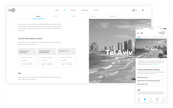
Guide
Visitor info is divided into two main groups: leisure recommendations, and basic information. The latter being quite crucial. Things that may seem clear cut to us, are completely foreign to visitors; so accessibility was a top priority for us while creating the Guide.
This page is divided into sections that we’ve concluded, via research, are highly important to visitors and may ease and speed their navigation.
The main page has general information about Tel Aviv, and also lists information centers and free wi-fi spots, which we learned visitors were unaware of
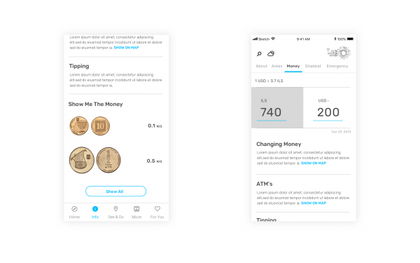
The Money page covers useful capital issues, and reinforces the One Stop Shop concept with an added money exchange feature.
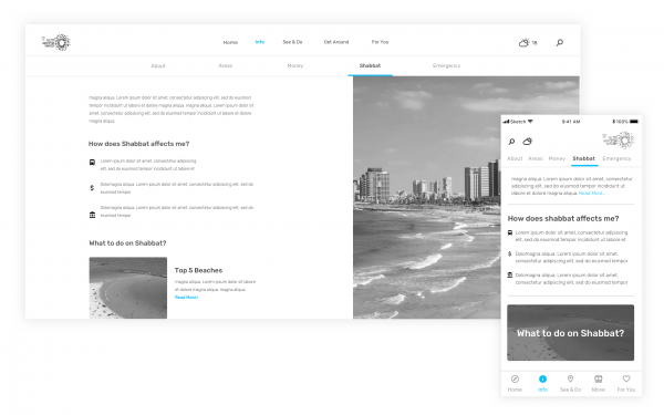
Here’s another pressing issue that arises when visiting Israel: Saturday, or Shabbat, has everything running differently, from transportation to supermarkets. This had our interviewees quite confused, so we saw fit to dedicate an entire section for this matter alone.
See and Do
We created a page that has anything and everything valuable and fun Tel Aviv has to offer. This page is great for active users who are avid travelers and who love exploring and picking preferable activities.
This page is tricky since it has to work for everyone equally, and still keep a personal touch. Therefore, we designed a double navigator – so if horizonal scrolling isn’t for you, you can set it to classic, and still explore every category just the same.

For you
The ultimate user page with saved settings and personalized preferences. Users can arrange activities by Done and To Do so that they can easily track everything down, and feel increased satisfaction as they continue exploring.
Mobile vs. Desktop
Our research has shown that both platforms evoke different associations: our mobiles are an available assistive tool, and is perceived as immediate (for searching addresses, checking opening hours, etc.). Desktops are usually used for planning, and are perceived as a better, more convenient platform to explore and collect knowledge prior the trip. We found desktops to have a much more exciting effect on visitors in the planning stages.
The two platforms are similar in many ways, but both exist differently – so naturally, we designed each with a fitted interface, according to the interviews and observations we’ve conducted.
Unlike the mobile feed, the first feature that the desktop version of our interface offers, is the Highlights Gallery. It enfolds everything Tel Aviv has to offer, inducing excitement and curiosity. The Event feature was strategically moved to the bottom, since we figured that most desktop users are not actually in Tel Aviv at that moment, so current events aren’t as relevant to them.
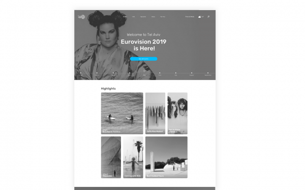
Showing a map alongside the highlight list helps users locate different attraction while moving around and planning their days.
Every section was thoroughly tested and reexamined with the client and potential users, to give the best, most accurate results and make our interface as friendly and useful as possible.
__________________
We made it!
This project was a universe of challenges and goals, all stemming from a basic need: information accessibility for Tel Aviv visitors.
Segmenting our audience has helped us crack this task. We created an authentic and meticulous product based on different usability patterns for different folks – an approach that allows the product to breathe, grow and expand.
Differentiating mobile from desktop was helpful in assessing every possible way we cross paths with the user – while planning, learning about the city and searching for inspo on the desktop, or navigating through the city via mobile while exploring it.
Our takeaway is eventually the same thing that has always been a guiding principle to us: knowing our users, where they come from, how can we reach them and how to make every experience as easy, simple and joyous as possible. These are intentions to live and work by.
__________________
UX Team: Nivi Tepliz, Marina Talias, Naama Katz
UI Team: Meirav Frosh, Yasmin Malki, Tal Mohr, Aylina Krumpmann
By Yehoram Davidi, Hadas Sadeh
Mass shooting or a deadly tsunami have a shocking impact, in more than one way. In a matter of minutes, dozens of live videos are broadcast in all social platforms.
Read MoreBy Doron Goldenberg
7 things that brands can and should do these days. COVID-19 has us all in a whirlwind but honestly, our country regularly has its fair share of emergencies and crises on all...
Read MoreBy Tal Epstein
A well-known principle of marketing is that people don’t connect to facts. It’s stories that they connect to. More than a decade ago, American marketing guru Seth Godin argued...
Read MoreBy Firma - Change Matters
יש מצב שמהצד, יזמים נראים סופר אסופים וחדורי מטרה – אבל בפועל, מדובר באנשים בשר ודם שפועלים תחת...
Read More